Identity Design
Identity Design
Out of context: Reply #80
- Started
- Last post
- 109 Responses
- Miesfan0


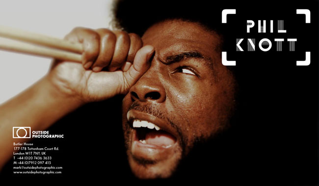
- it's inconsistent with it's variations. Main logo should be a circle inside the brackets...********
- rather than the fully stroked box.********
- I don't mind it, but i see what you're saying for sure. The top and bottom don't meet the edge the same.********
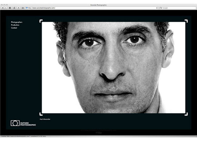
- It's a camera, you boobs.i_monk
- obviously, but the circle is verticaly off-centered and so it looks wrong IMO.********
- makes sense that it isn't perfectly centered to messeo
- Maybe it needs to be more off-centred? I like it nevertheless
Ianbolton
- it's inconsistent with it's variations. Main logo should be a circle inside the brackets...