Designing sites for mobile
Out of context: Reply #2
- Started
- Last post
- 8 Responses
- Boz0
Biggest problem with jqtouch like framework is that if you want to use media (audio/video etc) or device API you will have a disconnected user experience.. it will close your app, open the device's app and since your site (even if you added it to the homescreen) it will have a disconnect. This also applies to youtube videos for example.. on iOS it will launch their native YouTube app and it will totally take over, so when you are done with the video it will keep running their YouTube app not yours.
This is in general more of a problem in iOS than it is on Android because Android has a different way or running apps.. Even if you call a player on Android for example, it will automatically slide from right into the main screen and play the video.. once you are done you can click BACK button on Android phone and it will go back to your app because the multitasking still has the initial app running so everything still feels as one single experience even if you called a native API such as video playing.
This is why in iOS, the only real way to play a video inside your own app is to use Objective-C and iPhone's SDK or use 3rd party runtimes to develop like (Mono, Adobe AIR).
As far as resolution goes.. you should design your interfaces in a liquid layout. Look at it as doing 100% width and height type of thing and positioning elements.
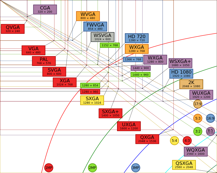
You should design per standards.. for example, most mobile devices today support standard video resolutions.. there are multiple ones, depending on the display sizes but you should really design at 320x240 as the smallest one. On screens any smaller than that it's probably not going to be a smart phone.
Going forward I think it will be safe to work with higher resolutions.
For now , this could be your guideline:
Now.. for mobile devices going forward (Android and WP7 and I think even Blackberry) they are all using standard resolutions from above.
These would be common ones:
QVGA - 320 x 240
HVGA - 320x480 (iPhone, Blackberry Bold, Palm Pre)
WVGA - 800x480
WVGA - 854x480
WSVGA - 1024 x 600 (smaller tablets like 7" Samsung Galaxy tab)
HD720 - 1280x720
WXGA - 1280x800Iphone 4 / iPod Touch 4 = 640 x 960
iPad / iPad 3g = 1024x768