Show some recent work
Show some recent work
Out of context: Reply #2866
- Started
- Last post
- 8,728 Responses
- dyspl0
playing with my girfriend business card, while waiting she comes back from work.
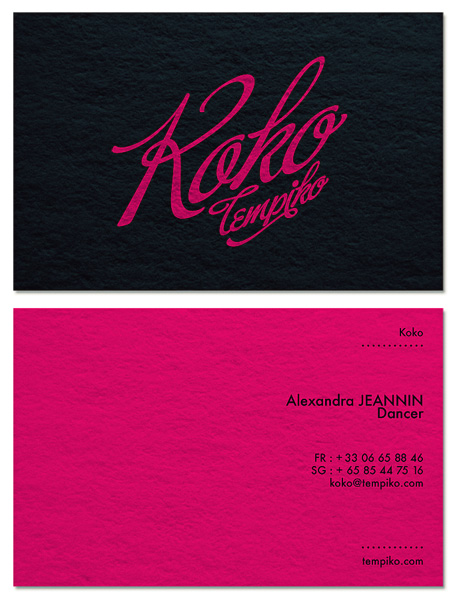
- need more work on it, but it's 4am here...dyspl
- loving the colour and the direction the logo is taking... not sure about the layout of the contact detailsAmicus
- probably the spacing being similar but not quite the same.Amicus
- yes, I was not happy with the detail side. both typo and layout need work.dyspl
- I'd like to give it a cabaret feeling without being too litteral (and as she does much more thn cabaret, I would like to keep the style more open)dyspl
- the overall look open enough.dyspl
- Food Job you are in a different country as my new ID is very similar.. inspired by the "Fame" logoDancer
- "Good" JobDancer
- You gave your gf's phone number the internets?
j/k looks cool.slappy - listen to Dancer, he knows this shit...
And what type of dancer is she? Should we include a pole on the left side to balance things out?OSFA - left to balance things out?
;)OSFA - I think Buffet Script needs a lot of work generally, but particularly the cap Rfoz