design a typeface 2009
design a typeface 2009
Out of context: Reply #201
- Started
- Last post
- 629 Responses
- hans_glib0
sssserifs...or not
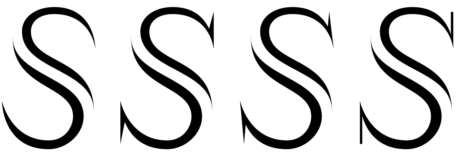
- the 4th one for meneue75_bold
- < this oneneue75_bold
- 1st, but make it less 8neverblink
- Fourth one looks too off-balance. The first one even more so, for me at least. I think the 4th is on the right path.********
- no i don't like 1 at all. i'm not wild about the straight serifs of 4 - too brutal?hans_glib
- 2 or 3 for me - keep it nice and sharp. 3 seems the better balanced but it looks too celtic tattoo...hans_glib
- #4 can you make that slab thicker? and maybe shorter?7point34
- I love 1 and 4.TomBac
- Its out of balance a bit, top half nees to be brought back a bit********
- a bit********
- i guess that's me put in my place then...hans_glib
- 3 has the best balance
Sandman_1982 - #2 and 4 are leaning too fari_monk
- 1 and 5 are my faves.. fuck it, drop 5, take one..serious_cat
- or do whatever neue sez.. then it is perfectly fine.serious_cat
- see not a bad suggestion
4 is my favWeLoveNoise - 2, 3, 4 look like they are going to topple over to the right at any second.juhls
- maybe it's more exciting that wayjuhls
- I wasn't going to mention the balance issue, don't see this as a crit thread, but I don't like the barbs on 2+3neue75_bold
- imo: they all fall to the right & the serifs are too far out from the vertical line created by the beziersversion3
- that's true, neue. nevermind my comments.juhls