blog
blog
Out of context: Reply #46143
- Started
- Last post
- 76,805 Responses
- ********0
what's the story behind this now prevalent look?
- what are its origins? what does it signify?********
- I've not noticed its prevalence, but then I hate design and avoid it at all costkelpie
- no hope for an answer then********
- I've not seen it a lot either, I am hopelessly out of touch tho.Jnr_Madison
- fuck it********
- footnotes?********
- (god is in the)********
- yet another
annotated topography of chance******** - (friends of mine btw)********
- I can't decipher your answers********
- —footnotes?
(which 'look' do you mean?)******** - —(god is in the)
footnotes.******** - —yet another
annotated topography of chance
(
http://en.wikipedia.…
)******** - —(friends of mine btw)
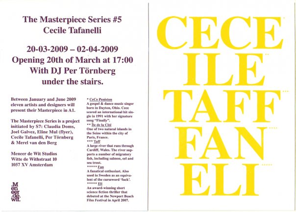
it happens that flyer was made by and is for the aforentioned.******** - eeeeeetttttt...
cecile n'est pas une pipe!******** - no, the whole, purposely awkward, unadorned serif-y mix of left justification and centered********
- sort of no esthetic esthetic********
- re: left justified/centered combo: contrast? hierarchy? tension?********
- besides...
it's not meant to look polished, the 'masterpiece' is a single a1******** - (poster)********
- ps clarification:
the footnotes i referred to are those which make up the content of the flyer.******** - (in the first place)********
- what are its origins? what does it signify?