Show some recent work
Show some recent work
Out of context: Reply #1619
- Started
- Last post
- 8,728 Responses
- hektor9110
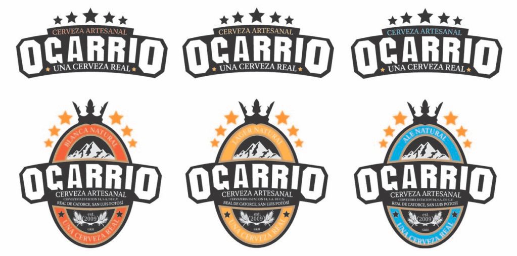
New identity for artisan beer in Mexico

- the head on the cups illustration looks a lil funny. i'll take a case plzJG_LB
- very nice logos********
- I can't get past the A_salisae_
- The relationship with the G & A is rather strange, infact attached to the crest shape the type looks wrong IMO!!!uncle_helv
- yeah, i wish the A was as fat as the rest of the family. :-) other wise, not bad.akrokdesign
- second the fatter A. Also kerning and it looks like the R's need some rotation (very slight)Amicus
- it's mainly that I want to see a curve run smootly across the bottom of the G A RRI LettersAmicus
- Make the A biggerAnders