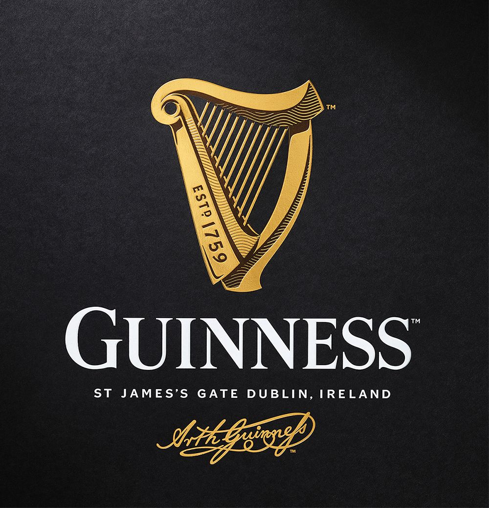
Guinness logo
- Started
- Last post
- 26 Responses
- imbecile1
this is an excellent photo...
- as much as the one in the original post ;)Bennn
- go fuck yourself ben. better yet, go hit another old woman in the subway. i was complimenting the photo you twit.imbecile
- dude_niko
- oh... my bad for pointing out he hit a woman.imbecile
- no wait... fuck him.imbecile
- So much unecessary violenceBennn
- and you know i've never hit a woman i hopeBennn
- you told us you did. so you're a liar, or violent.imbecile
- scarabin0
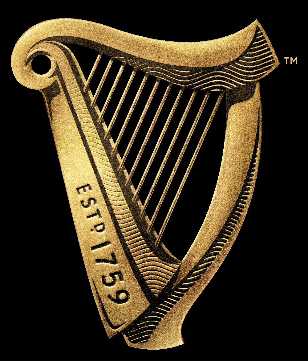
looked it up out of curiousity. i guess it's based on this hideous monstrosity

- http://www.wirestrun…scarabin
- were you wondering what it was?drake-von-drake
- i was wondering why such an ugly instrument would become their icon, yes.
sorry, irelandscarabin - that said, i do enjoy the beer from time to timescarabin
- looks more like a lyre than a harp anywaydrake-von-drake
- lol it looks exactly like a harp and not like a lyre at all in comparison.set
- Looks hideous but I'm sure it sounds amazing. Very much the Adele of the harp world.set
- docpoz3
wow. the anti-minimalist direction. touche.
- Gucci3
Saw this a few days back. Lovely stuff. It feels much more hand crafted and carefully considered—as Wolfboy noted, more in the spirit of the brand rather than design trends. I wonder if design as a whole is moving away from "simplicity" as a default design solution.
- detritus0
ooh, that's really nice.
I don't quite understand where the shading comes from in the 'estd. 1759' area - is that pure colour graduation? If so, why not evident on the larger photo?
Anyway, good work - will certainly do for another 20 years, at which point they'll probably go minimalist one colour again :)
- cbass991
Its nice, but what happens to the details when it gets scaled down?
- they turn into cyanide and reverse osmosis into the can then your beerdoesnotexist
- Wolfboy2
Here's the Design Bridge project page:
- MHDC0
New logo is posted with ® in one and TM in other
- doesnotexist0
tasty
- drake-von-drake-1
lovely design and I drink it
- you should contact them - maybe get a credit or tagline added to the branding.Fax_Benson
- it stays?monospaced
- Bennn0
Great work
- dbloc0
well done. Love it!
- set0
Solid
- lvl_130
really nice. +1
- prophetone0
It stays.
- desmo0
Ace!!!
- nocomply0
First time in a very long time I saw a logo refresh and thought, "Wow, now that's an improvement!"
- Fax_Benson0
sits really nicely with the new typography
