Guinness logo
- Started
- Last post
- 26 Responses
- Gucci3
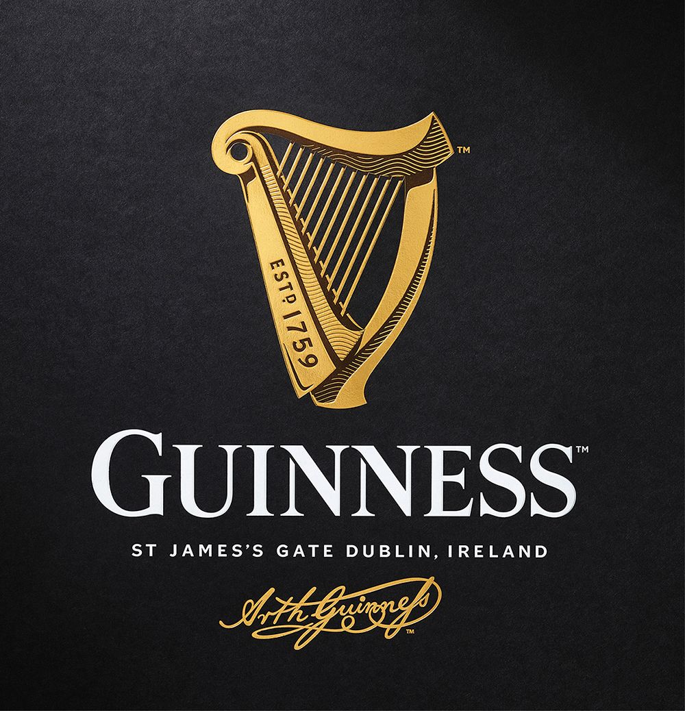
Saw this a few days back. Lovely stuff. It feels much more hand crafted and carefully considered—as Wolfboy noted, more in the spirit of the brand rather than design trends. I wonder if design as a whole is moving away from "simplicity" as a default design solution.
- formed-4
Dunno, looks like it's trying a little too hard to me, I don't see heritage I see 3D. The 3D harp part doesn't make sense, if you want history just pull back one of the early marks and refresh it, don't force some busy 3D stuff in there. I really don't care for either harp, though.
Font is fine, but I agree with some of the comments that the other one is more unique (I don't like the old mark, but the really old ones looked like they could have had charm with a little refresh).To each their own, I guess.
- drake-von-drake-1
lovely design and I drink it
- you should contact them - maybe get a credit or tagline added to the branding.Fax_Benson
- it stays?monospaced
- Wolfboy2
Here's the Design Bridge project page:
- docpoz3
wow. the anti-minimalist direction. touche.
- Wolfboy
I don't know if this has been mentioned (I can't see a thread), but Guinness had a brand refresh the other week and it's a really nice piece of work:
Before & After:

Detail:
I love it, a brand really trading on their heritage rather than just following trends in logo design.
Here's a write up: http://www.underconsideration.co…