Deviantart rebrand
- Started
- Last post
- 37 Responses
- set0
Not sure I get it. The mark is ok visually. Hate the cut off type.
- i_monk0
Italic V and A...
- benfal990
better than the old one. About time for the update. They should update their website too.
- feel0
- RGB0
I think it is lightyears ahead of the old identity design, but I'm not sure I really care for the new one. Given all of their process work, it's hard to believe anything about this being a copy of some shitty website's logo. That said, losing the DA effect was kind of silly, IMO. Saw some much better options in the process work.
- feel0
i like it, the video sold me the logo
- fate0
Should have shortened it to "Devart" or "Deviart"
- Miguex0

compared to what they had before, it's THE BEST LOGO EVER MADE IN THE HISTORY OF HUMAN KIND.I mean.. look at that thing...
There's no way in hell I will believe for a second that you think this is not a huge improvement
- Miesfan0

- haha!Krassy
- farts simutaneouslybklyndroobeki
- Why is he in boxers??OSFA
- for full balls-in-the-face effectscarabin
- freedom0
Didn't know they were still around. Livejournal for artists.
- sublocked0
Apparently they also made $10M in revenue in 2010 (latest article I could find with stats). That's huge. I had no clue.
- trendkill0
maybe a stretch but my mind keeps seeing.

might just be like colors that i am associating in my brain.
- e-pill0
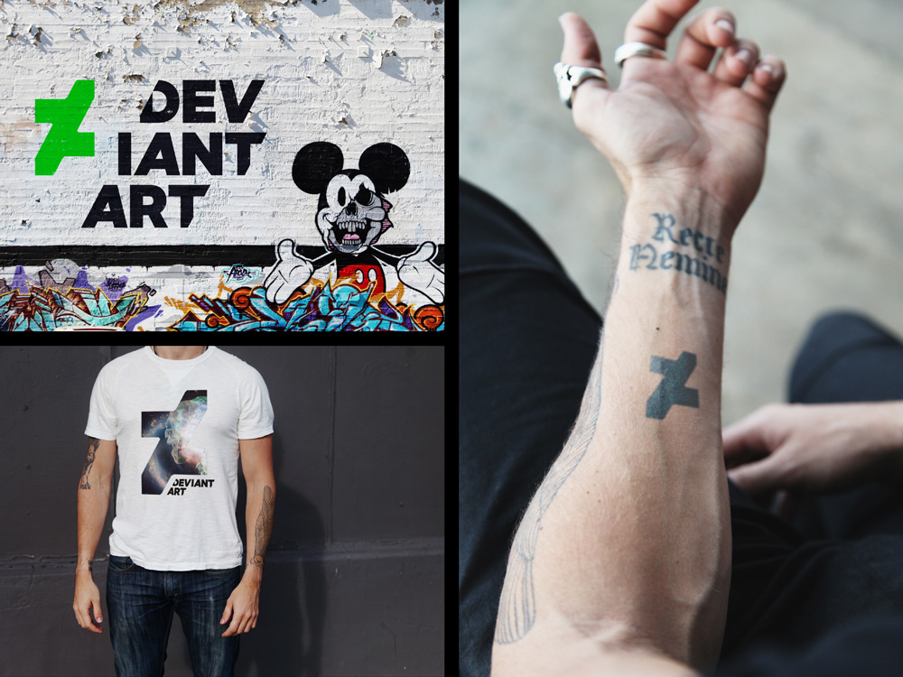
been using deviantart since 2006.. the new logo is muc hbetter than what came before it, cept to me it holds nothing.. doesnt relate to anything.. i see their video on the branding but thats just idiocy from those that made it to soldify what they want to be paid for.. the new logo does nothing for me.. the site itself has gone thru multiple weekly changes btu still is a complete mess.. yeh its coold for new branding to evolve and not be stagnant.. but meh the new logo looks too designed.. plus i keep seeing a "z" in it which relates to nothing.. meh
- iCanHazQBN0

- lolinteliboy
- CoTDORAZAL
- lol. i thought this was funny, but didn't know where to post it.iCanHazQBN