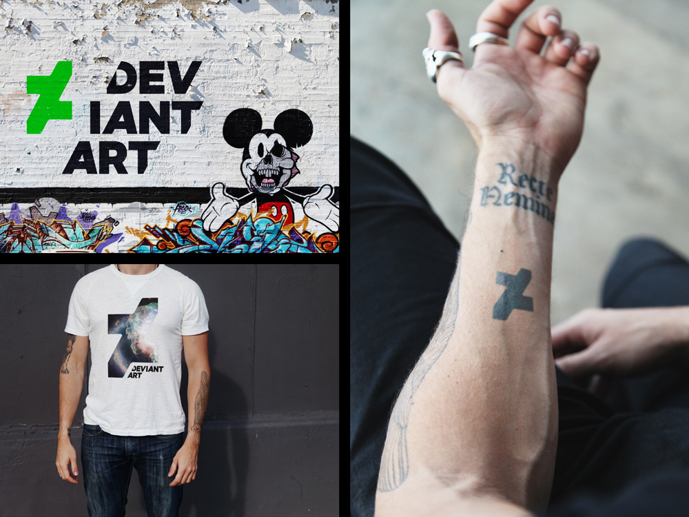
Deviantart rebrand
- Started
- Last post
- 37 Responses
- breadlegz
What do you think of the new logo and brand?
- fadein110
Not as naff but also doesn't work that well. Would have liked to see the other variations of it.
- pinkfloyd0
Looks lousy
- set0
Not sure I get it. The mark is ok visually. Hate the cut off type.
- i_monk0
Italic V and A...
- benfal990
better than the old one. About time for the update. They should update their website too.
- feel0
- RGB0
I think it is lightyears ahead of the old identity design, but I'm not sure I really care for the new one. Given all of their process work, it's hard to believe anything about this being a copy of some shitty website's logo. That said, losing the DA effect was kind of silly, IMO. Saw some much better options in the process work.
- feel0
i like it, the video sold me the logo
- fate0
Should have shortened it to "Devart" or "Deviart"
- Miguex0

compared to what they had before, it's THE BEST LOGO EVER MADE IN THE HISTORY OF HUMAN KIND.I mean.. look at that thing...
There's no way in hell I will believe for a second that you think this is not a huge improvement
- Miesfan0

- haha!Krassy
- farts simutaneouslybklyndroobeki
- Why is he in boxers??OSFA
- for full balls-in-the-face effectscarabin
- freedom0
Didn't know they were still around. Livejournal for artists.