Apple WWDC '14
- Started
- Last post
- 138 Responses
- ukit20
I think it depends what you find valuable. There may be flaws with Apple's approach in terms of openness, etc, but can't Android equally be criticized for not paying the same attention to detail that Apple does when it comes to UI design and interaction?
- who cares, right? android phones have better specs /smonospaced
- Absolutely not. The latest stock android kitkat has a pretty solid UI and UX. Have you used it on a decent phone...?set
- I'm a harsh critic when it congress to design and UX but Google are finally leading the wayset
- Comes*
Fucking android keyboard.set - haha, you came fucking your android keyboardmonospaced
- Hahaset
- sem0
I just want to highlight that I have both an Android and Apple products. That is possible you know. I don't understand the loyalty that limits yourself to the best of what is out there in the world.
This does not have to be a VS thread.
- agreedmonospaced
- Me tooset
- a person? making sense? on QBN?scruffics
- YAY, I said something we can agree on...now, back to the Chick Of The Day.sem
- so true - me too. Love my Android phone, love my iMac. But DO NOT automatically love anything Apple or Google. Ridicfadein11
- Android phone and an imac. The perfect combo. Me too.set
- set0
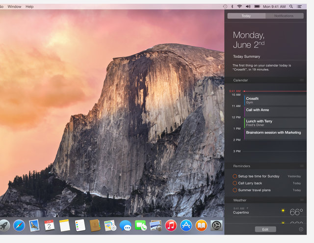
Interesting article, though from the still it looks pretty nice to me.
http://m.fastcodesign.com/303143…
- uan0

- They're nice. A vast improvement on iOS7 for sureset
- "shall we go flat or half flat?"
"What's flat?"fadein11 - WHY WOULD THEY KEEP THE SETTINGS A SQUARE...dbloc
- the iPhoto icon is super nice nice now, no more kidprophetone
- present souvenirs about places, no more ppl. ppl went to the contacts, good idea dropping the @ there.uan
- never been happier with an iTunes icon too. And yes no more mystery child in Preview. NiceBrokenHD
- magnifier is more modern toodbloc
- I guess they thought the actual dimensions of a stamp weren't ideal. Better golden ratio that shit.jtb26
- stamp sizes and ratios varymonospaced
- utopian0
The new UI still feels a bit outdated, and playing catch-up with the Google and Microsoft UI.
- yupcolin_s
- Indeed. The rest looks pretty, but I still can't get past that icon rowformed
- agreed. very google icon esque.Hombre_Lobo
- ukit20
Microsoft UI reminds me of corporate bullshit and sitting in on endless meetings at a giant company:) Even when they do a nice job with certain aspects of the design you still hate using it.
Android UI looks like they purchased some vector graphics off iStockPhoto.
- :)ukit2
- You keep saying that. I'm willing to bet you haven't used KitKat on a latest Gen device.set
- Until then your continued opinion it's uninformed and worthless....set
- OK, I admit I'm relying on screenshots. I will check it out next chance...ukit2
- Android is still clunky, Apple's is still generic, Windows isn't fluid but design wise makes more senseformed
- Yeah none of them are perfect, but I think Apple still surpasses the rest.ukit2
- Microsoft didn't even bother to update the desktop icons from Windows 7 to Windows 8ukit2
- < he thinks it surpasses the rest without trying the others lol - fanboi right there that isfadein11
- No, I just said I haven't tried newest Android yet.ukit2
- Android experiences can be worlds apart based on which phone and which versionset
- Kitkat on a nexus 5 is solid and imo Sense on the HTC One is about as good as it gets right now.set
- ernexbcn0
All Apple threads are destined to become VS threads, you just need to give them time.
- fadein11 vs emexbcn - outside now!fadein11
- Your 'contribution' to this thread is far more tedious than anything else in here. Pipe down.set
- This thread: ----> http://cdnl.complex.…ukit2
- iCanHazQBN0
The icons are all still disjointed. After all this time, they still can't see that???? Look how detailed the Preview icon is, and then look at how simple the iTunes icon next to it (just a flat music note in a circle).
Nothing matches anymore. There are like 5 different icon styles there.
- I'm not sure, the main function of an icon it's differentiate itself from other icons.set
- I think they fit ok together stylistically. A lot better than iOS7 anyway.set
- If they're too uniform they're not going to do they're job properly.set
- Their*set
- half a flat design but in the right direction would be my opinion - 6/10fadein11
- But icons can be different yet still consistent.........iCanHazQBN
- The problem is, these look like they were all created in different years by different designers.iCanHazQBN
- they were, for reasons that Apple approved, and set is defendingmonospaced
- differentiated works, helps for faster use, even if not totally consistentmonospaced
- I don't think they look too bad togetherset
- iCanHazQBN0
Why does there need to be ANY kind of photographic element in a Mail icon??? Ridiculous. At a glance, that image of a flying eagle looks much more like a Photography application than a Mail application.
- I like it. It's a stamp. Not a generic "mail" icon.inteliboy
- fadein110
What amazes me is with all their resources they haven't come up with a beautiful screen based typeface for all their OS's. Instead the plump for an easy option Helvetica - classic but not designed for the screen and actually not great in many screen applications.
Imagine a custom UI typeface crafted by Apple and type designers - synonymous with the brand.
Just plain lazy. Hate saying it but doubt Job's would have chosen an over-popular and safe option like Helvetica.
- iCanHazQBN0
Why don't they go with this font they've been using?


- because they decided to make it more consistent with iOS and so onmonospaced
- The type in iOS is terrible. They should use this for all their UIs.iCanHazQBN
- < he means instead of helv fullstop.fadein11
- doesn't work good with small sizesfyoucher1
- benfal990
"How Apple Fanboys React to Every Apple Announcement" - Mashable
- Monospaced brotha
from another Motha.utopian - :Dutopian
- lol utopianHombre_Lobo
- haha great video.
"i know its been done but apple have been waiting to do it the right way" LOLHombre_Lobo - lol this videosem
- Monospaced brotha
- pango0
Hahahaha how so many none apple fan boys likes to trash apple related thread yet nobody cares about android related thread.
- the fuck is android???..iCanHazQBN
- it's a QBN tradition alreadyernexbcn
- pango0
to the honest. first thing i'd do if i do get the new OSX update is to turn off the transparency.
- http://img4.wikia.no…ernexbcn
- They spent a full 32 minutes talking about this transparency gimmick yesterday.iCanHazQBN
- lol, 32 minutes!Hombre_Lobo
- Thx! :)
I knew my story is cool!pango
- ernexbcn0
This guy thought they were going to use a new custom font:

But they ended up using Helvetica Neue like iOS 7
- Hombre_Lobo0
"They spent a full 32 minutes talking about this transparency gimmick yesterday." - icanhazqbn
translucent desktop os windows are the future!

windows vista say whaaaaaat
- My thought exactly! And FWIW, I find the transparency distracting.nocomply
- I spent roughly 32 mins on the PC at work trying to turn that thing off.pango
- lol pango!
i think they made it look ok tbh, might be decent. dont like it on ios 7 though.Hombre_Lobo
- georgesIII0
This is me when Steve cook said they were bring swift 3D back,

- benfal990
true about the Health app and the iWatch ^^
