Logo feedback needed
- Started
- Last post
- 41 Responses
- cannonball19780
In all honesty, I would focus on boiling down your values a little more. If you put them out there like that, it strikes me that you want use them as a tool for communication.
While I applaud your values, a list 12 words long is not memorable, nor are the values you listed. I would find some distinct and unique words that interlink or encompass one or more of them that make them distinct. Something like "humanist" or "ethical" or "accountable" that feel more like they describe a tangible aspect of something and can be put together in a mission statement—raise more of a flag of a certain color, instead of the "we are good" flag, if you catch my meaning.
- You're right. It is long. We had hot debates over this. It shouldn't be more than 5 values in my opinion.Beeswax
- All those values could be tucked under participatory democracy. http://en.wikipedia.…Beeswax
- pick 3doesnotexist
- cannonball19780
Also, if I were your designer, I would veer away from the typographic "O" treatment and go for something with a bit more political clout, considering what your organization is engaged in.
Perhaps a column, or a flame, or an amphitheater. Or maybe something the common man can understand and where his voice lives, such as a town square.
- yeah, I need to find objective symbols like that.Beeswax
- set0
I like the hand a lot. Don't think it works with the dot, might look better bigger.
- uan0
- reanimate0
They all seem a little too generic and ornamental. None of them say participatory democracy to me. It's hard to see the connection between the logo and the idea.
- kasparius0
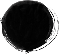
this enso one is the best, do not go for the techno type of logos it doesn't match to the subject...
- monospaced0
Like but needs refinement. There could be a narrower gap between the ends of the rounds strokes where the fingers and jawline meet. Also consider making the finger length differences slightly less obvious. Let's also see the one-color versions, and how it might work on other backgrounds, just in case.
- timeless0
option/concept 2 (with some imagination) one could say looks like a breast
i recently had a concept go onto client presentation and client immediately said: "We can't use this, it looks like boobs." Which opened our eyes and then that's all we could see.
- breadlegz0
Just out of interest, who decided these are the values:
"Democracy, Transparency, Integrity, Equality, Justice, Freedom, Solidarity, Peace, Respect, Cultural & Environmental Protection, Ethics, Productivity"
Does the organisation live those out? Or was it an exercise in raiding the dictionary and sounding like you care?
- i_monk0
Clowns must stop.
- freedom0
Make sure it works small.
- bjladams0
"I'm part of a non-profit NGO in Turkey that is founded to develop and support participatory democracy methods.
We created logos and let people vote for them, the ones below are the final 4 of those selections
At this point we're still not sure about any of these logos."
why not just go with what the people voted on?
--
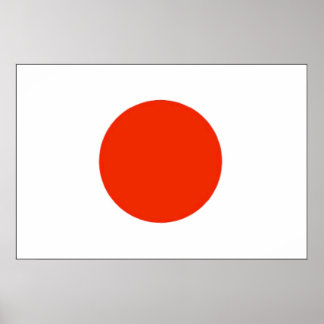
my opinion: the top one looks best to me - although i saw it before reading and assumed it was for a camera/picture service.
perhaps all the parts coming together would make the "point" instead of having the dot?second looks like a boob. third a saw-blade. fourth a modern drawing of a bum.
- doesnotexist0
this is neat

- maybe work on the colors and how they play with each other?doesnotexist
- looks like iOS 7monospaced
- I see an anus in the negative space, which is shooting out rainbow diarrheawagshaft
- But that's just me.wagshaft
- you mean the green dot? that's not negative space, btw.doesnotexist
- Okay. I see firm ass cheeks int he negative space. You get the point.wagshaft
- no i don't get your point, please elaborate.doesnotexist
- http://www.shout-des…wagshaft
- Gangrene arseholeset
- < LOLdbloc