Logo feedback needed
- Started
- Last post
- 41 Responses
- Beeswax
I'm part of a non-profit NGO in Turkey that is founded to develop and support participatory democracy methods.
Our values are;
Democracy, Transparency, Integrity, Equality, Justice, Freedom, Solidarity, Peace, Respect, Cultural & Environmental Protection, Ethics, ProductivityOur name is "Ortak Nokta" which means Common Point/Spot.
We created logos and let people vote for them, the ones below are the final 4 of those selections.
At this point we're still not sure about any of these logos.Which one do you think is a better fit for such an organisation?
I'm hoping to find a 5th alternative that collected all the strong parts of these 4. Do you have any suggestions?I wrote some comments about them.
Symmetrical, Calculated, Boring, Unifying, Bold
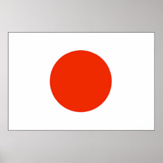
Organic, Represents change & dynamism, not so attractive, weak

Symmetrical, Calculated, Boring, Unifying, Bold

Attractive, Out of the box, too hierarchical for an NGO

- uan0
- reanimate0
They all seem a little too generic and ornamental. None of them say participatory democracy to me. It's hard to see the connection between the logo and the idea.
- kasparius0
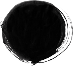
this enso one is the best, do not go for the techno type of logos it doesn't match to the subject...
- timeless0
option/concept 2 (with some imagination) one could say looks like a breast
i recently had a concept go onto client presentation and client immediately said: "We can't use this, it looks like boobs." Which opened our eyes and then that's all we could see.
- breadlegz0
Just out of interest, who decided these are the values:
"Democracy, Transparency, Integrity, Equality, Justice, Freedom, Solidarity, Peace, Respect, Cultural & Environmental Protection, Ethics, Productivity"
Does the organisation live those out? Or was it an exercise in raiding the dictionary and sounding like you care?
- bjladams0
"I'm part of a non-profit NGO in Turkey that is founded to develop and support participatory democracy methods.
We created logos and let people vote for them, the ones below are the final 4 of those selections
At this point we're still not sure about any of these logos."
why not just go with what the people voted on?
--
my opinion: the top one looks best to me - although i saw it before reading and assumed it was for a camera/picture service.
perhaps all the parts coming together would make the "point" instead of having the dot?second looks like a boob. third a saw-blade. fourth a modern drawing of a bum.
- doesnotexist0
this is neat

- maybe work on the colors and how they play with each other?doesnotexist
- looks like iOS 7monospaced
- I see an anus in the negative space, which is shooting out rainbow diarrheawagshaft
- But that's just me.wagshaft
- you mean the green dot? that's not negative space, btw.doesnotexist
- Okay. I see firm ass cheeks int he negative space. You get the point.wagshaft
- no i don't get your point, please elaborate.doesnotexist
- http://www.shout-des…wagshaft
- Gangrene arseholeset
- < LOLdbloc
- doesnotexist0

- hmm I can't really give it any meaning. Pointy bottom is too pointy without a dot or smtng.Beeswax
- i mean, kind of embodies all of this bs: Democracy, Transparency, Integrity, Equality, Justice, Freedom, Solidarity, Peace, Respect, Cultural & Environmental Protection, Ethics, Productivitydoesnotexist
- &cdoesnotexist
- reminds me of a water fountaindbloc
- Beeswax0
These are some drafts that I didn't put for voting. The one on the left is an "n" inside an "o".

- Beeswax0
This one was my favorite but since too many people associated the star with communism or socialism(don't know why it's so bad) I took that one out of the voting as well.

- Beeswax0
Also, our long term goal is to become a political party. That's why an association with certain wing is risky.
- hellrod0
Maybe build an "O" from one of the sides of this... (like a three ringed O using these colors)
- While a rainbow color scheme denotes inclusivity, it isn't very "Turkish" culturally. I see more earthy reds and greens and browns and oranges. Also some irridescent blue.cannonball1978
- some irridescent bluecannonball1978