YouTube logo redesign
- Started
- Last post
- 49 Responses
- instrmntl0
Flat losenge. I just did smt w youtube and we had to switch out all the identity.
- ukit20
Anything would have been better than the old one but leaves you wondering if they couldn't have come up with a better concept than just a play button.
- The play button is a strong concept. They probably want it to become their Nike's swoosh.Krassy
- Maybe a computer created it
"This is the only logical solution Larry"ukit2 - "Make the logo bigger."
"I'm sorry I can't do that Larry"ukit2 - hahahahahah
twokids - good point Krassy, makes sense.Miguex
- @Miguex see you Saturday night at the Sports Arena? :)Krassy
- < lol @ ukitanimatedgif
- doesnotexist0
the new youtube logo is a play button. yes, youtube is a site you can watch videos on.
- I get it now. Brilliant concept.ukit2
- basicallydoesnotexist
- Except that they dont own that play button and its used everywhere on the internet for non-youtube videos.CygnusZero4
- Something that would be immediately recognized as THEIRS might have been smart.CygnusZero4
- Now when I see that symbol, since its such a common icon, I wont know its theirs without the text.CygnusZero4
- Nice versatility lmaoCygnusZero4
- twokids0
I liked the old one better. The new one doesn't even look like a logo, it looks like video player.
- twokids0
well to be fair, the old logo does reference something that does not really exist anymore (tube tv), which is in a way cool but probably lost or many many youngsters. Still, the new one sucks. No personality - but CLEAN. Same thing they did with the Caribou logo.
- Are you saying the same people who did the YouTube redesign also did caribou?monospaced
- dbloc0
The totally should have gone with something along these lines.

- prophetone0
i like it and am happy with its recent ios app update, better interface.
- identity0
systems. systems. systems.
they offer dozens of services - that will all eventually, if not already, get this treatment. Its all about getting it under the same banner and on a utility end, making the most of all the resources and opportunities they have. why shouldn't this reflect in their visual brand - and why shouldn't it be as simplified as possible?I think they're actually late in doing this.
- CygnusZero40
Simplicity is a tricky thing thing. If its not a symbol that can be immediately identified with them, how well is it really going to do?
If I saw the old tube icon with no copy in it, just the gradient, I would know right away who's it was just on that alone. Thats brand power. But if I see that new one without the type, it could be anyones. Could just be a generic video player icon, which it basically is anyway.
Thats the trick you have to solve with simple logos. They didnt solve it imo, they just took the obvious route and could bite them in the ass. To me its no different than taking mercedes, and if they redesigned their logo to just be a car silhouette. It was unmistakable before, and wouldnt be after the "simple" redesign.
Half the humans on Earth know that tube icon with the gradient very well. Its embedded deep in their minds, so now they go with a standard play icon that isnt much different than what you would see on any site that has a video in it? Ok.
- doesnotexist0

- well playedtwokids
- this is a common size to see things these days?identity
- I wonder how this would fax?identity
- how do you think i got it so small? fax machine.doesnotexist
- :-) I gotta stop taking shit to seriously. Thank you.identity
- identity0
They don't have to worry about image association because they're already ubiquitous and a banal part of our culture (online or otherwise). A start up or a less-than-google company has to really try to come up with something proprietary to create differentiation. They own everything - they're different in the sense that no one is them.
Your current argument about the "play button" not being ownable is true - but eventually, we will associate it with google. That's just a fact. In the same way we associate the typeface Catull with them, their color palette - when in a digital context - A PRIMARY color palette by the way as well as online mail, maps, directions, etc.
They're big enough to come in an own anything they want (unless previously claimed by Apple or Facebook - but even that's arguable. Their spread alone could visually brand something in most people's mind in a few impressions.You can argue wether it's well-designed, granted - but it's going to do a VERY effective job for them in terms of brand recognition. As will all their other offerings once they get this treatment. It can ALWAYS be better. (ah, sweet subjectivity). The mercedes comparison is adept as mercedes has MANY competitors in that class - Bugatti would be closer in terms of competitors, but now you're dealing with a VERY niche audience that cares more about function and car design than the logo (which is heritage based and probably can't be considered a relative part of this conversation). Google isn't niche, its everywhere and everyman. It's the GE of the 21st generation.
cool?
- cool.doesnotexist
- cool?dbloc
- So why change at all?bainbridge
- SteveJobs0
1953:
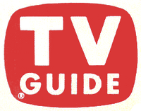
- Obviously their inspiration and the original source of association.monospaced
- capn_ron0
How about at this size? Which one will you recognize? the play button or the old you tube thingy?
.
VS
.
- bainbridge0
Hipster vibe to eliminate Vimeo?

- marychain0
Generic garbage. Took about an hour for this refresh looks like.


