Logo Criteria
- Started
- Last post
- 84 Responses
- oey0
Tomorrow I meet with the client. I still have other directions I want to develop a bit further.
albums, I'm doing one based in yours but with the type mote similar with the one I've drawn previously.
gonna try to put some groove in it.
cheers!
- oey0
Hey Ho!
I've been busy all day.
Arrived home and couldn't stop making these.
Logo approaches will follow hopefully soon.Swirls (some still need refinement)...


- vsplus0
I thought you might be interested in this guys work as he has dealt with swirl and patterns as well: http://www.etiennebardelli.com/i… aka Akroe.


- albums0

- this is kind of fund_rek
- better. this way the ! works better with the K.oey
- I totally like it. I've been trying to achieve this result, the lines, without success. see previous page. and this swirl is simpler.oey
- Too unreadable I thinkukit2
- i-m trying for two hours to achieve a swirl that starts like that and with tighter grooves. i don't know why but i can't.oey
- http://blog.lynda.co…oey
- fuck me fucking adobe engineers!oey
- albums0

- I'm watching the video above but my key controls don't work like in the video. i feel slightly frustrated. back 2 schooloey
- restore keyboard to defaults and change language and voilá, it's working. breed oey!oey
- okay albums. i finished work and now I go home do my version of what you showed here and use it like the first piture i posted in this page...oey
- example I showed in this page building a brand connecting both labels. these two are totally awesome!oey
- pig0
I'm liking this Work In Progress thing.
We should nominate a different person each month, like a workshop. But with more cynicism and cats and Lolcubes.
- hans_glib0

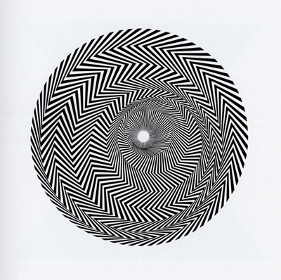
get some riley in yer life
- oey0
The name of the label "TINK" is not a typeface.
I draw it from scratch inspired in a mix from Futura, Syntax and Frutiger in a way to make it compact and related to the original logo when it comes to the "K".Something like this.
- d_rek0
Who's designing this logo? The client or you?
- Good question. Me. It's just the guy's not sure about anything. Not even if he wants a new one.oey
- He questions everything. Than has doubts. Goes back and forth in his opinion.oey
- |He has other label. With no whirl. First wants to keep things separated. Now wants the whirl also in the other logo.oey
- Records from the other label have the logo in the middle of the vinyl. Too confusingoey
- not even he knows what he wants.oey
- Good question but we can't all earn money telling clients to do it our way or fuck off... Not all the time anyway..set
- oey0
Client says my whirl looks like the "Coffee and Company" one.
I made him realize that the original whirl is the one that really looks like the coffee one.The label was released way before.
- Beeswax0
Did you try the whirl for the dot of exclamation mark?
Maybe align RECORDS to the left put the whirl instead of the dot but big, overlapping the K.
I dunno, maybe works.
- oey0
I feel so stupid.
could have done all this yesterday.albums, you are the best!
the world is mine now.thanks a lot.
it's almost 8am, I'm going to sleep.