Logo Criteria
- Started
- Last post
- 84 Responses
- oey0

- oey0

- oey0
Right now I'm doing some variations over albums letters, the ones uploaded in colors, to apply the spirals like above but taking in consideration the stroke size.
Awaiting feedback from client.
Gonna keep you updated and will upload the experiments later.
Thanks!
- it seems like you need to slow down, and work on refining a legitimate idea...sine
- that's true sine. too many spirals and too many ideas.oey
- but I've got this specific idea I want to develop to combine things in a homogeneous wayoey
- for the vinyl label. both labels together and separately. stamp. stencil. stationery.oey
- refinement, work, test prints...oey
- syst_m0
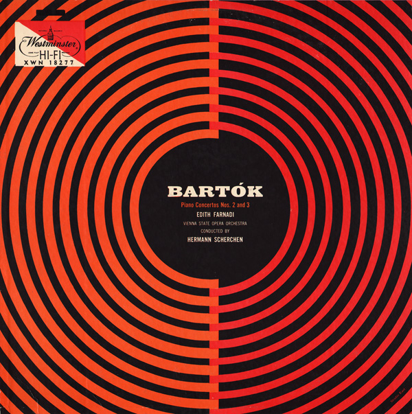
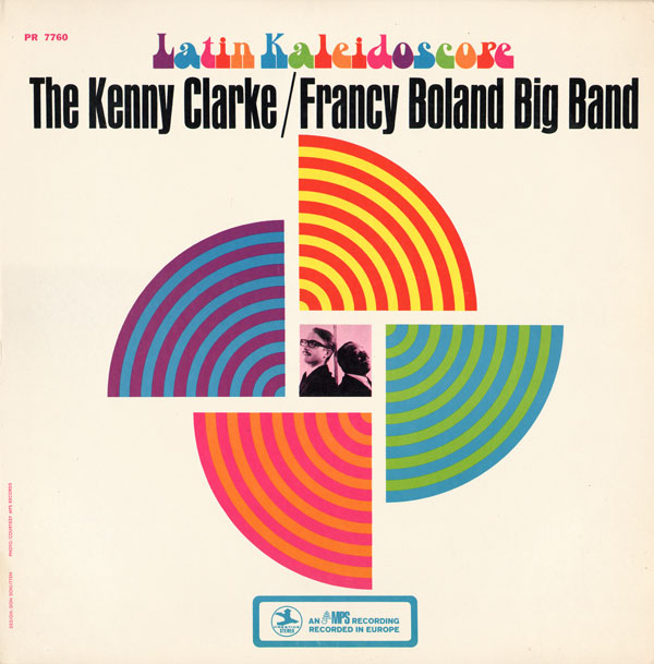
- love the 60's design feeling...vaxorcist
- so good!oey
- why not use this as direct reference? so gooddoesnotexist
- fiver0
yeah, this could be a nightmare to print at small sizes. you'll likely have to do several iterations for a style guide based on scale...
- oey0
After 4 hours of sleep, I've been playing around.
These are the results so far.


- Okay, I see that the space between the words in TOMORROW... need to be worked out.oey
- Number 4 has some possibilities. I like that you put the dot on the i to work.Continuity
- oey0
I'm gonna experiment and apply what I've learned.
I totally love what you did albums!
- oey0
Now i just have to increase the number of concentric dividers to start.
it results better with the square "I" dot so you can center the spiral there.
Still I've tried, with the letters I've drawn the other day, but with less amount of dividers.
So what follow are some possibilities.I think this is definitely it.
I can use just the word or the full circle.
The two names together.This will give me time to work a proper brand.


- oey0
I feel so stupid.
could have done all this yesterday.albums, you are the best!
the world is mine now.thanks a lot.
it's almost 8am, I'm going to sleep.

- albums0

- I'm watching the video above but my key controls don't work like in the video. i feel slightly frustrated. back 2 schooloey
- restore keyboard to defaults and change language and voilá, it's working. breed oey!oey
- okay albums. i finished work and now I go home do my version of what you showed here and use it like the first piture i posted in this page...oey
- example I showed in this page building a brand connecting both labels. these two are totally awesome!oey
- albums0

- this is kind of fund_rek
- better. this way the ! works better with the K.oey
- I totally like it. I've been trying to achieve this result, the lines, without success. see previous page. and this swirl is simpler.oey
- Too unreadable I thinkukit2
- i-m trying for two hours to achieve a swirl that starts like that and with tighter grooves. i don't know why but i can't.oey
- http://blog.lynda.co…oey
- fuck me fucking adobe engineers!oey