My New Project - Expedition Bureau
- Started
- Last post
- 89 Responses
- ohhhhhsnap0
what'd ya end up with?
- albums0

the logo is too close to the text, it needs to match the line spacing of the copy
- mg330
Also - decided against the lens iris. Too many logos out there with that.
- sine0
just saw this in the tour de france coverage

- HijoDMaite0
This thread is wonderful! You guys are killer designers. Damn I love the evolution of this. mg33 I'm excited to see your project come to life soon!
- sine0
just employ albums to do the design already. jesus. he doesn't even charge anything.
- sureshot0
I agree a little with albums.
- randommail0
a good flag logo
- mg330
Ideaist - Does one of these grab hold of you better?

In actuality, the triangular logo won't appear next to the large name on the site as it does above on the coming soon page. It's actually placed above the logo alongside the nav. Ex:

Thanks for your input.
- albums0
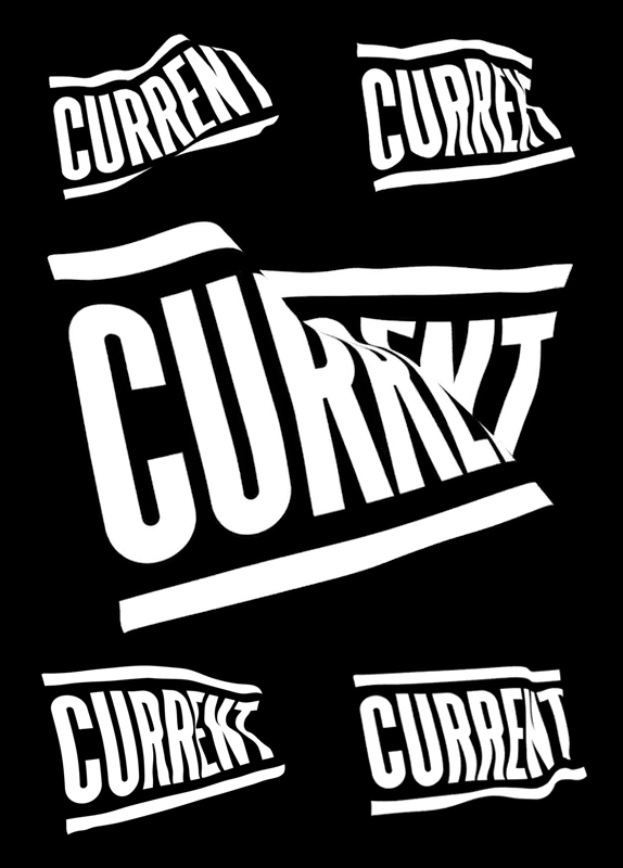
If you're going to do a pennant, the text should be inside it, distorted to fit the triangle.
You might consider distorting the EB in this manner. Maybe adding a contrast color to the left edge.
With the name over the EB pennant, it seems top heavy, I believe it should be below.
Bureau gets lost on the black background.
I would try making the stroke width the same for the logo and name when they are paired together if you are going to continue down the pennant outline path.
You might try making the pennants different colors instead of outlines, then experimenting with color combinations of EB or just knockout the text showing the background color.
- mg330
Idealist,
You don't think all of these are too close to that MEC logo, right? The one on the bottom is definitely something entirely different, as are the few three-triangle ones above it.
I came up with these ideas after looking at camera selector knobs and debating which landscape icon I liked more. I use Nikon so went with that but I don't think it's immediately connected to that brand any more than a mountain and a cloud would be (Canon).
I want the focus of the sites photography to be on landscape/travel/adventure images, but I'm fine with the occasional urban stuff. In that regard I do wonder if a mountain icon/logo miscommunicates anything. I do really like the bottom one though.
- I agree BUT I think you're split in to many directions with your main graphic right now. Type is tight.ideaist
- I'd say try 1 of each graphic done in a similar style; globe, flag, mountains, aperture, etc...ideaist
- ...Look at them all next to each other and bring 2 (maybe 3) forward creating variations of each...ideaist
- ...I know this feeling of being able to go in any direction; liberating but can lead to hours of endless experimenting!ideaist
- mg330
- blue is hard to see on the background. If you are potting the logo on photos, that might be something to consider.cannonball1978
- Also that text is too light and aliases badly. Would love to see something humanist but also robust.cannonball1978
- mg330
Thanks albums. The pennant approach was my original idea, and i did a few sketches but it just didn't look the way I wanted to after working with it in Illustrator and PS. So, started to think of it more like a nautical symbol, or some kind of wayfinding symbol.
I'd actually go with the image posted in my first post as the banner image (with updates to the triangular logo) however, I don't like seeing Expedition Bureau right-aligned, but the combo of text and logo left aligned on the page. It's just the way my mind works I guess; I don't like the empty space in front of Bureau. Believe me, I've obsessed over it plenty.
- albums0


- Jesus dude... you're a machine.mg33
- :)albums
- I'm with you though, the more I pushed the distorted pennant, it wasn't working.albums
- Yeah, I came to realize that good old ones were all hand made.mg33
- exactly, it was going to take more time than skewingalbums
- The second one in the series takes it. Stays simple and true to the original concept.Arvizu
- mg330
This is what I was talking about above. Disregard color inconsistencies and the nav; it's just an early mockup with the arrangement I'm talking about.

That space to the left of Bureau drives me crazy.
- albums0
I thought this after you said "wayfinding"


