I'm not a designer, but ...
- Started
- Last post
- 77 Responses
- albums0
if you're going to cut text, at least have the dotted line on the cut, not spaced away
- fresnobob0
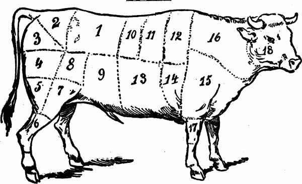
Some of those made me think of this sort of thing...
- hans_glib0
this is a visual of the concept i was trying to describe, not an attempt at a finished item.
The idea being that the peas have made the cut and the pods haven't. A variety of images could be a range of fruit, some ropey, some pristine, or prepared veg with the peelings. but always with a defined line - it'd be interesting to do to with the objects themselves rather than cropping as my visual here.

- I getcha, and thank you so much for putting in the effort, it's much appreciated.eoin
- cannonball19780
If it's a logo describing a chef making a cut with a tool, use sans serif.
If it's a logo about a foodie making a "cut" as a way of excluding another group of foods to distinguish quality, go with a serif.
- cannonball19780
Also, if you want the guilotine to look less severe, put it an an angle, not straight up or down.
If you want it to look less ominous, put the blade below the logo, like the cut was already made, not above it, liek the cut is impending.
- eoin0

- mg330
Which steakhouse in Dublin is the one with the great black and white photo ad that's always in the Aer Lingus magazine? It's just a guy in a bloody white t-shirt with a cleaver. I love that ad.
- Ha! I am the sometijes deputy editor, editor-in-chief of that magazine, it's called Cara. The ad you are talking about is for Marco Pierre White';s restaurant in Dublin. You are right, it's a great image of one of the world'st influential chefs. he has actually given me an incredible quote for the back of the book: "'eoin' is someone whose opinion I trust".eoin
- ... for the back of the book: "'eoin' is someone whose opinion I trust".eoin
- 2. ... Marco Pierre White's restaurant. It's an iconic image of one of the world's most influential chefs. He gave me a quote for (go back to the previous comment now).eoin
- SO ... these comments should be read: 1, 3, 2, 4 (sorry) http://greensandbean…eoin
- eoin0

- I think there has been progress.
Still some tweaking to do. But you might want to try a totally different concept.hektor911 - Something less literal. Maybe.hektor911
- Thanks dude, but I don't know if I have any more time to devote to it, tweaks for sure but a complete re-imagining, not so much. It's holding up everything else! maybe I can revisit it when I have more time.eoin
- ... holding up everything else! maybe I can revisit it when I have more time.eoin
- I think there has been progress.
- i_monk0
"it's holding up everything else"
That's ok, it's only the logo that will appear on everything ever associated with the thing, not important. Just type it out in Times New Roman, it'll be fine.
- eoin0

- If I had the dollar to hire a designer I would, but I don't. I can give it one more day of tweaking/re-imaginin... and then I have to move on.eoin
- have to move on.eoin
- You get what you pay for. A cheap poorly executed design.qTime
- You think I don't know that ... you roboplegic wrongcock?eoin
- @qTime jokeseoin


