I'm not a designer, but ...
- Started
- Last post
- 77 Responses
- i_monk0
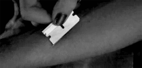
Needs blood spray.
- MrNibs0
If you're going for the guillotine thing, this is not bad at all. (needs cleaning up tho)

Guillotine is a bit harsh but I do like the idea of the site as a chopping block. A guillotine blade is a harsh abrupt ending to whatever is being reviewed on that site and the butcher knife and chef knife are incrementally less so. It seems to focus on the negative aspect of reviews but if that's the attitude the site is going after than embrace it.
If the site is going to open up to more than just restaurant in the future then dropping the chef knife association makes sense.
You've done a lot of good exploration and like mono said 'more than most clowns out there'. I think you need to decide what best suites the site and narrow the focus to the ones that accomplish that. What ever concept that is, beat it to death until it looks right.
Good stuff! Time to finalize! It ends tonight! :)
- yeah, share your top 5 with the client and get a direction to finalizemonospaced
- albums0
Try
the
-----
CUTIn a medium stroke wide serif
- monospaced0
The neverending critique
- cannonball19780
These logos where the "cut off part" is removed just makes the logo look like it is folded over or obscured. To tell the story about the cut, you need the parts on both sides of the cut.
- eoin0

- hans_glib0
this is a visual of the concept i was trying to describe, not an attempt at a finished item.
The idea being that the peas have made the cut and the pods haven't. A variety of images could be a range of fruit, some ropey, some pristine, or prepared veg with the peelings. but always with a defined line - it'd be interesting to do to with the objects themselves rather than cropping as my visual here.

- I getcha, and thank you so much for putting in the effort, it's much appreciated.eoin
- fresnobob0
Some of those made me think of this sort of thing...
- utopian0
I like where you are going with this.

More emphasis on the word "cut" is needed. Make "the" smaller and "cut" larger.
- eoin0

- albums0
Inspiration