Photoshop color kungfu help
- Started
- Last post
- 20 Responses
- MrAbominable
I've always liked Sarah Moon's photography (fashion / fine art). She often has a really saturated color palette with a signature green. I just came across this guy's photo today:

he's doing sort of the same thing she does. that deep green cast to the shadows... mmm. how do you get there from a standard cmyk/rgb pic? duplicate the k channel?
- MrAbominable0
Some Sarah Moon...


- Miguex0
I doubt this tint is a signature style of a single photographer because there that have been doing it for so long, it probably goes back to the 40s or 50s. Instead, I will tie it to a specific kind of camera/ film combination.
That being said, you can replicate any camera/ film look these days with a little tool called 'Curves' in photo shop
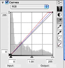
Also use the 'saturation' palette to remove richness of color (since these days, digital cameras shoot extremely rich/ colorful shots).
- MrAbominable0
thanks Miguex for the links. I'm not convinced that just torquing Curves alone is going to get me where i want to go.
Sarah Moon draws from 50/60s Harpers, Vogue, Bassman, Brodovitch but has been commercially shooting since the 70s. She's a thing. She might not own the green but her style is a signature.
- utopian0
Instagram Dat Shite®
- Ambushstudio0
Sara Moon´s color was achieved by cros processing slide film (transparency), it means you would process slide film with c-41 chemicals (C-41=regular color film).
Tjhis was really big in the nineties, Ellen Von Unwerth was really big around this trick, cross processing ypur fil would give you this overly saturaterd colors and they would become yellowish/green as a result of the chemicals destroying the silver particles instead of fixing them...
I´m no expert on the process but I´ve been shooting for 17 years now and did this a lot in the late nineties, I asume you have to tweak photoshop a lot and experiment, it will be a no brainer soon, though you should really try to get your hands on some slide film, shoot it 1 stop over exposed and tell the developer to put it in the C-41 machine and push it 1 1/2 stops, have fun!
- ughh excuse the typos, im very tired...Ambushstudio
- cross processing was big in the 90s? I think you had your numbers upside down :) maybe you meant 60s? :)Miguex
- thank you!MrAbominable
- I meant I know it from the 90´s as I started shooting then... pretty sure people did it way before :)Ambushstudio
- Miguex0
Yeah, I was writing my response before you posted the second set of images. On your first post you only asked about a specific green hue on a digitally retouched image, hence my response. To achieve that, Curves/ saturation is what you need.
- Miguex0
To your second post, if you are wondering about the texture of the images, then you need to find out what kind of film was she using, and I would try to find a black photo scanned of that image so you can 'sample' the noise on it.
I'm linking the first one I found on google images for reference, but you might want to dig a bit more if you want to get it right:
I would add that on top of the image with a transparency filter (overlay for example, play around w whatever you think it looks best)
then add a bit of blur to the image, since her photos look like long exposures due to having subjects not sharp. this should get you started, but the MAIN think will be curves when it comes to color, the curves palette is the equivalent of film cross processing technique.
- the dark halo 'vignette' look is only on the digital photo, I assume you are not interested in achieving thatMiguex
- MrAbominable0
brrrrrrilliant! that was the information i was hoping for. thanks Miguex and AmbushStudio! And thanks to Utopian for keepin it real.
probably should have called this "sarah moon help". how i got good feedback quickly from that crap title i'll never know.
- you wouldn't have got any good feedback if you're title were some what more proper.pango
- *your...pango
- note to self: abstract and jackass all the time. thanks.MrAbominable
- we keep it real son! :)
Hope that helps!Miguex
- Ambushstudio0
if you´re gonna go for film, experimenting with different temperature on your lights will give you awesome results, I found that neon (gas) sources would give me really cool blue and magenta tones, Tungsteen would go crazy green and yellow, Pushing your film will also give you really cool grain.
- thanks AS. Mostly, i want to know if i can hack illustration work into this palette in PS.MrAbominable
- Roberthannink0
Instagram filters as photoshop actions
- MrAbominable0
^ nice resource, Robert. thanks.
- scarabin0
multiplied gradient map
- MrAbominable0
to what end Scarabin?
- Miguex0
You could look on one of these actions:
http://photo.tutsplus.com/articl…
found it following the instagram filter link by Roberthannink
- dyspl0
I second Scarabin, gradient map works well, set in soft light and screen layer mode.
- MrAbominable0
i'll look in to all this talk about gradient maps. i don't know that phrase.
thanks all for the filter links. i'm not convinced i'll find a Sarah Moon filter but there are a number of cross process ones that'll walk me up to the door. good resources, all the same.
- even if there was a signature photographer filter, famous or not, it will be required that you make adjustments for every photoMiguex
- photo, if everything had a plugin that was so easy, then there would be no need for designers, photographers or photo retouchers right? :)Miguex
- image retouchers right?
:)Miguex - rightMrAbominable
- utopian0
mono_bump

