NIVEA rebrand
- Started
- Last post
- 21 Responses
- lowimpakt0
it's some kind of cream, or something.
- Juanmonk0
Don’t just look at the letters—take in the negative space between the characters and you can see the negative space is perfectly balanced—which in turn creates a balanced logotype. After all the blue circle is as much a part of the logo as the lettering. The kerning between the N & I makes perfect sense.
- Fax_Benson0
I'm sure Nivea didn't want a trendy new logo, rather a slight tweak of the existing identity, which they got. It looks good. Everyone's happy.
- sothere0
It would be cool for the designers of this to think... 'lets test what what we can get away with as a rebrand. let just give them there old logo back to them.' we'll create an idea about respecting the original designer so we dont have to change the mark and we'll just put a circle around it.
That would be an interesting rebrand. kind of an emperors new clothes. but with the emperors old clothes given back to him saying they are new.
brilliant!
- mikotondria30
It's not a mark that's been designed to be pored over on large monitors by people that pick at their own logos like tweakers picking at their nails or scabs, it's designed to be glimpsed, at a small scale, possibly in a dark purse or partially covered in a drawer, and in that respect I think the redesign (ahem..) might have something going for it. Road signs look overblown and sparse upon cold still reflection, but at 80 in the dark and rain, that extra space is invaluable..just a thought.
- Have you seen NYE in NY? Not exactly to "glance" overformed
- mg330
I don't care for the parts of the N, V, and A that extend above the other letters. Just looks sloppy.
- formed0
Looks fine. Looked fine before.
I am still not sure what they did here.
- They made a profit?attentionspan
- Indeed they did. I hope it was a lot, brilliant selling the client the same logo back!formed
- hektor9110
this is very interesting..
- CygnusZero40
One of the comments at the bottom puts it well, talking about if they "fixed" the kerning.
"Perfection is boring, the Nivea logo re-balanced would be dull and bland. Probably would look like it's been typed out on HFJ's Verlag font, interesting as a font but as a logo indistinct and lacking personality."
- CygnusZero40
The kerning makes sense to me. The A at the end has such a gap between it and the E, Plus you get the space on the sides of the V, so it almost feels more balanced to me with the spacing between the N and I.
- Basically what I see and why Im ok with it is N IVI ACygnusZero4
- N IVE A ratherCygnusZero4
- doesnotexist0
i like the kerning, oddly
- Christian0
Remove one word. Profit.
- what word was removed?monospaced
- Take their old tins. Remove the word Creme. Profit.Christian
- monospaced0
old:

- dbloc0
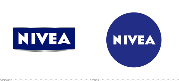
so all the did was add a circle?
- fucked with the kerningmonospaced
- IVEmonospaced
- And tweaked the blue.Continuity
- mekk0
K ER NIN G
- fadein110
- This is why it's important to name your thread correctly.monospaced
- +1 mono
No way Filter can help in that case.Continuity - because it is the shittest search functionality on the webfadein11
- sorry the importance of naming a thread correctly on QBN comes very low in my daily priorities. We know QBN is your life mono :)fadein11
- life mono :)fadein11
- Seriously, you didn't have to be an asshole about it, I was just pointing out a way to avoid timelining.monospaced
- sorry - monday morning headfadein11
- inteliboy0
Nice one. Kerning throws me off. And putting something in a circle seems an easy solution. Though it works well across their products and is nice and clean. A rarity these days.
- putting it in a circle and the odd kerning is referencing to the history of the brand. one could argue about the kerning but in general I like that idea.pressplay
- pressplay0
Here’s the article on brand new/underconsideration
http://www.underconsideration.co…
Solid job, nice to see that the trend of raping iconic logos with bevel, gloss & gradient is slowly fading