Character or kerning fail?
Character or kerning fail?
- Started
- Last post
- 8 Responses
- qTime0
"confusing experience for their customers"
What??
- GeorgesII0
OLD

- LukeO0
I reckon they spent too long looking at the logo—saw an imbalance and created another in trying to remedy it.
Yes, I've done it before. The shame!
- albums0
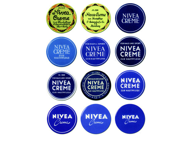
N IVEA
or when its too small on screen
H IVEAIt can't be too hard to find a balance in the N & A widths by making some slight adjustments.
As their client my reaction would be... WTF?
Personally, the 2nd row, 3rd over and first 2 of the 3rd row should have been the inspiration.
- I disagree, I like the extra space between the N and I because it's more balancedmonospaced
- Looks shit broalbums
- utopian0
I could park a tractor trailer between the "N" and the "I"....
- qTime0

- I hate to say it, but I'm kind of loving that Gillette one.Continuity
- No all aroundalbums