New Univ. of California logo
- Started
- Last post
- 35 Responses
- kgvs720

- Newkgvs72
- weirdHijoDMaite
- looks like a preloaderspot13
- typography is awful. Why have 'of' on its own line?BaskerviIle
- Just absolutely horrible in every sense of the word. someone shoot me out of this retarded globe with retarded humans.CanHasQBN
- damn canhas!ohhhhhsnap
- Baskerville said it... Why have "OF" on it's own line? What are these morons thinking??CanHasQBN
- HijoDMaite0
There is actually 10 universities in the University of California system, they all have their own logo so only the parent UC seal was changed.
- i_monk0
It's bad.
- sublocked0
The old one was better.
- monospaced0
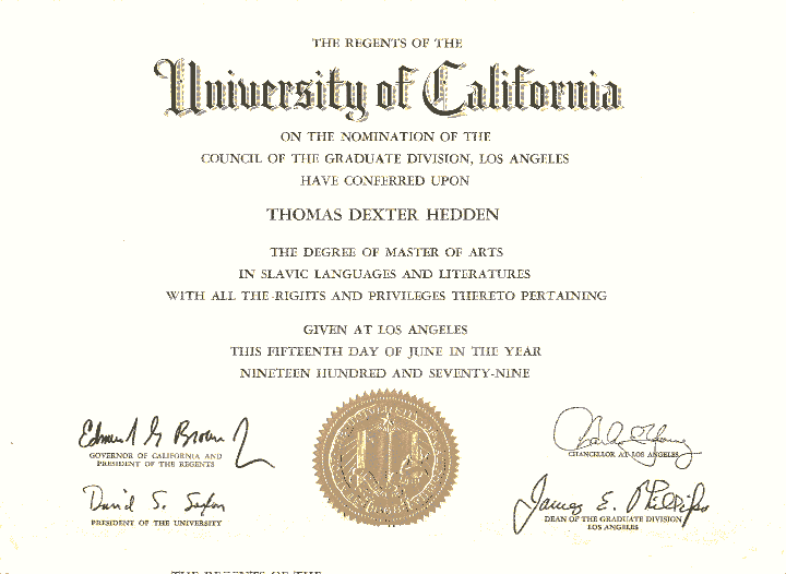
Not going to look so great on the diplomas, in my opinion. It's nice having the seal embossed into the paper. This is going to look odd, methinks.
- How's the logo gonna work with the diploma below, for example?monospaced
- even though it's from 1979monospaced
- they are still the same todaymonospaced
- GeorgesII0
:DÜSSELDORF
- HijoDMaite0
"The university's original logo -- with its open book, 1868 date stamp and "Let there be light" script -- will still be in circulation, appearing on president's letters and official university documents. But marketing materials and websites will feature a radically simple and more contemporary symbol: a little "C" nesting inside a shield-shaped "U.""
- monkeyshine0
Who was responsible for this design? Please not Pentagram again. :)
- in house team teamutopian
- well at least they didn't pay some agency for that. bleh.monkeyshine
- utopian0
- what a BUNCH OF SHITEGeorgesII
- it's not that badmonospaced
- That's terrible.instrmntl
- why the crank?newuser
- newuser, exactly what i was thinking. i like the light switch though. even the let thereohhhhhsnap
- be light idea. they should have taken that further.ohhhhhsnap
- http://img717.images…ohhhhhsnap
- haha i love the tenuous link between the book and the U shape, thats desperate!Hombre_Lobo
- nocomply0
Just terrible. I feel like it cheapens my alumni status. I'm all for moving forward and embracing the future, but with an institution like the UC you've got to give a bit more of a nod than that to the past.
I personally liked the old logo.
- at least they're keeping it on all the "official" documents, like the diploma and stuffmonospaced
- I graduated from UCSDmonospaced
- UCSD here too!
HijoDMaite - Wow, UCSD alums unite! I was one of their 1st ICAM majors.nocomply
- Revelle, 2001monospaced
- fuck Revelle you did all that GenEd??HijoDMaite
- I did. Plus two full degrees. In 4 years, bitches.monospaced
- well done.HijoDMaite
- when were you there?monospaced
- I graduated 2011. career change after 6 years military and 6 years corporate worldHijoDMaite
- CommunicationHijoDMaite
- Damn dudes... Class of 2004. Double major in ICAM and Latin American history. Roosevelt college (has the most ladies!)nocomply
- ... most ladies!)nocomply
- most ladies? you're suffering from, "Triton Eye"HijoDMaite
- lol @ Triton Eye. Despite the nerdiness, I think we had some hot SoCal bitches at UCSDmonospaced
- 'you've got to give a bit more of a nod than that to the past.'
That is spot on.Hombre_Lobo
- instrmntl0
That is awful. It's practically making a mockery of the system. There's no ounce of history or intellect in it. What a shame.
- It's an historic institution for knowledge. This logo makes it seem like its a Gap or other shit clothing store. You'd never see Harvard rebranding.instrmntl
- Harvard rebranding. There's an honor to tradition.instrmntl
- Yale rebranded, and they're an old school ivy leaguemonospaced
- newuser0
UC became a for profit internet school.
- you went to a State school, huh?monospaced
- ???????newuser
- That's what I thought. ;)monospaced
- boobs0
Who did this?
- BrokenHD0
let there be light