Pub/bar logos
- Started
- Last post
- 36 Responses
- PlantedMedia0
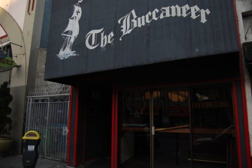
Love this place... and their brand mark.

- that you designed.ian
- lolFax_Benson
- looks like some graphic in a legend of zelda videogamemonospaced
- < it does, lolset
- link drinks a guinness in o'connor'sset
- Chimp0
Can you tell us a bit more about where you are trying to position the brand? Gastro Pub, Traditional boozer, Family pub, Organic Brewery?
- i_monk0

- < like thatdbloc
- one of toronto's best pubs for sure. amazing design throughout too.ahandfulofdust
- "Amazing design"? Am I missing something?Raniator
- Not sure on the mix of fonts, the layout or the 'queen beaver' myself.webazoot
- originally it was supposed to be called "the queen's beaver". true story.Gnash
- sine0
i hope it's called the "The Cock & Balls"
- DaveO0
To me it's all about what's real, real processes, very very rough translation of venacular... TRADITION. Also, NOTHING in CMYK.
After living in brooklyn for a couple of years and seeing how people treat bar and restaurant design here, there's a lot to be learnt. The worst are places that have taken over a beautiful old pub and tried to modernize it with their aluminium light fixtures and shit
- svante0
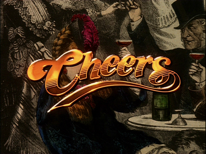
Not a logo but it's non-stuffy, 18th cent & hand done:

- 23kon0
What kind of pub? Traditional / Modern?
- Raniator0
Traditional. It's a lovely 18th Century listed building, all wooden beams and the like.
Needs to obviously fit with the look of the building, but I don't want it to be a stuffy, boring, stereotypical brand.
- detritus0
The first person to link that Russian 'English Pub' thing gets a bucket of shit poured down their throat.