Pub/bar logos
- Started
- Last post
- 36 Responses
- Chimp0
Can you tell us a bit more about where you are trying to position the brand? Gastro Pub, Traditional boozer, Family pub, Organic Brewery?
- PlantedMedia0
Love this place... and their brand mark.

- that you designed.ian
- lolFax_Benson
- looks like some graphic in a legend of zelda videogamemonospaced
- < it does, lolset
- link drinks a guinness in o'connor'sset
- pig0
What did you talk about in the brief with the owner? Do you have carte blanche, or does they have preferences?
If you have free reign, look at what mydo, DaveO & co. were saying earlier because this is precisely that. It's careful and contrived for what is a totally traditional looking venue. The pheasant illustration is clean and well rendered, but therein lies the problem, squire.
People don't want pretense from a pub, they want sincerity. I'd go handmade handmade handmade. Do a modern lick on the original signage. Get your hands dirty. Look at stupid ale labels. These are anti-design, but they're fucking great!
Props for having the courage to put your work on here in the first place, though.
- Does they (groan)pig
- < good advicemonospaced
- Yeah really good advice. Thanks pig.Raniator
- pig0
Is this the pub?
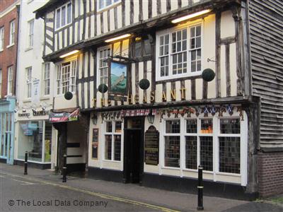
- goldieboy0
Your font choice doesn't feel 'Traditional' enough for an 18th Century building.
- utopian0
Park Bar
15 East 15th Street, New York, NY
(212) 367-9085
- svante0
Not a logo but it's non-stuffy, 18th cent & hand done:

- DaveO0
To me it's all about what's real, real processes, very very rough translation of venacular... TRADITION. Also, NOTHING in CMYK.
After living in brooklyn for a couple of years and seeing how people treat bar and restaurant design here, there's a lot to be learnt. The worst are places that have taken over a beautiful old pub and tried to modernize it with their aluminium light fixtures and shit