Pentagram just learned photoshop.
- Started
- Last post
- 49 Responses
- 20020
Very hard but easy to knock on Pentagram.
- noneck0
I agree that the work is disappointing, especially coming from Pentagram. However, I'm always cautious to criticize other designer's work - you don't know the environment it was created in. We don't really know how this mark fulfilled the brief. It could be that the client really drove the project, "Here, I sketched out what I want, the project is practically done for you!"
But yeah, shit's weak.
- noneck0
the client will not be driving Pentagram projects.
– fadein11I used to think that too, then I watched Michael Bierut talk about his clients. tl;dw - his clients are no different than yours. Some are great, some are shit.
- teh0
I just dont understand why they got rid of such an iconic logo for this? I know its the 100th anniversary but work that illustration in with the existing logo. I men come on!
- i_monk0
"I hope you're not serious." — CyBrainX
Why wouldn't I be serious? An update of the monogram would be worlds better than this stupid clock with fully rendered numerals and second marks.
- i_monk0
"If you choose to keep detail in a graphic approach, those details have to be correct. When a clock is not on the hour exactly, the hour hand is NOT pointed at the hour, but rather between hours. It’s also missing any character of the actual clock that is so special to millions of people. The font on the clock face is wrong, the hands aren’t the same shape, there is no indication of the 4-faced nature of the clock itself. Even the base isn’t stylised well. It’s missing sections." – CM Harington in the comments at http://www.logodesignlove.com/gr…
- true that. would think they'd use the standard 10&2 positioning anyways.doesnotexist
- They went with 7:13 or whatever because it corresponds to 1913.i_monk
- pressplay0
*sigh*
- identity0
I bet Pentagram is beholden to their clients to post the work on their site. Since they have (probably) nearly every logo they've ever made on there (also in their Marks book) I'd BET that by starting to edit NOW - it would be very clear to the client that they felt the work wasn't great. By sticking to the hard-rule of posting all their finished work, it takes the subjectivity of editing out - creating an open and honest look at the company's work over the years.
Imagine being that client and going to the site (which HAS to be a HUGE client/money fly-trap for them - i mean - look at their work...) and NOT seeing the logo they paid (and likely art directed) $1,000,000 for up there. Would be a slap in the face.
- i_monk0
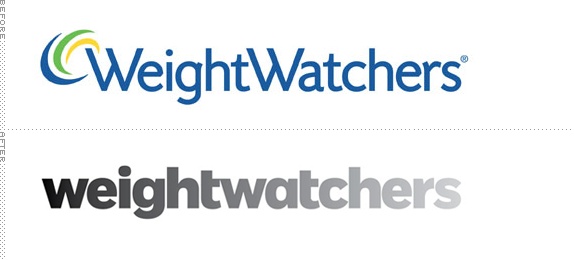
Pentagram swings and misses again:
- i like it, there is an idea behind itpr2
- gradient watchersstewart
- that's a "heavy" fontmonospaced
- An idea isn't enough.i_monk
- an idea is better then pretty execution.pr2
- idea + pretty execution is needed. anything less is a failure.i_monk
- agreepr2
- the gradient implies how WW will now fade into nothing.monNom
- Idea is nothing without executionanimatedgif
- GeorgesII0
I can feel my weight disappear,
what a soothing feeling
- dirtydesign0
the pounds are fading away?
- 74LEO0
I hate when a t is like that.
- nb0

- d_rek0
More dubious work from Pentagram. This time for renowned jewelers Swarovsk:


- yikes. they need to watch more MadMen.mantrakid
- bath salts? to eat each other?74LEO
- Wtf, that italic type seems completely random. It doesn't emphasise the appropriate part of the sentence.Hombre_Lobo
- fresnobob0
so incredibly shitty
- robotron3k0
they are much better at billing clients than doing design.


