Redesigning the NY Times
- Started
- Last post
- 45 Responses
- hektor9110
There is no advertising on the left one... interesting..
- CanHasQBN0
TSDR
- ismith0
"Show More News"
Well there's your problem... blogs are as they are, newspapers are a UX in themselves. There's certainly room for improvement, but this is like using arrow keys to drive a car.
- SteveJobs0
i could see this approach being more useful for mobile
- Geith0
4 comments? Wow. I expected at least a thousand. This story is all over the internets. LOL.
http://www.businessinsider.com/n…
- uan0
they got rid of a lot of text
- Geith0
agreed. it's too idealized and simplistic. pulling out advertising and social media would never fly, nor is advisable.
while I appreciate what he was attempting to do and the effort put forth, it falls short. the design itself is ok, but would have benefitted from more thought and exploration behind the business model in addition to design philosophy.
- Boz0
does not work. Can't say I like it...Not that I like the old one.. the old one is a mess.
it's also interesting that there are no ads.. this means they will most likely go full subscription.
I can't bother to read all articles but is this a real redesign or someone playing around again?
- ThePublics0
Looks like a basic wordpress theme. Total shite.
- ukit0
I found this fairly idiotic.
The NYT is actually one of the best designed sites for a large newspaper (along with The Guardian and the BBC). What he refers to as clutter is simply a solution for the need to display the optimal amount of information.
Ironically, his "redesign" is largely style (iOS bevels, trendy typeface) over substance as far as I can tell. The style isn't bad, but it doesn't present the solution he pretends it does. His answer to the clutter "problem" for instance is to simply remove all that extra text - but that sort of ruins the experience of using the site.
Also, while it would be nice to use custom fonts, that simply isn't a reality yet for a site with as large a readership as the NYT.
- ukit0
- dablammit0
Andy Rutledge is a jackass and his "redesign" sucks.
- TheBlueOne0
I thought it sucked btw. His idea of redesigning one of the densest newspapers out there was to turn it into a blog.
- cannonball19780
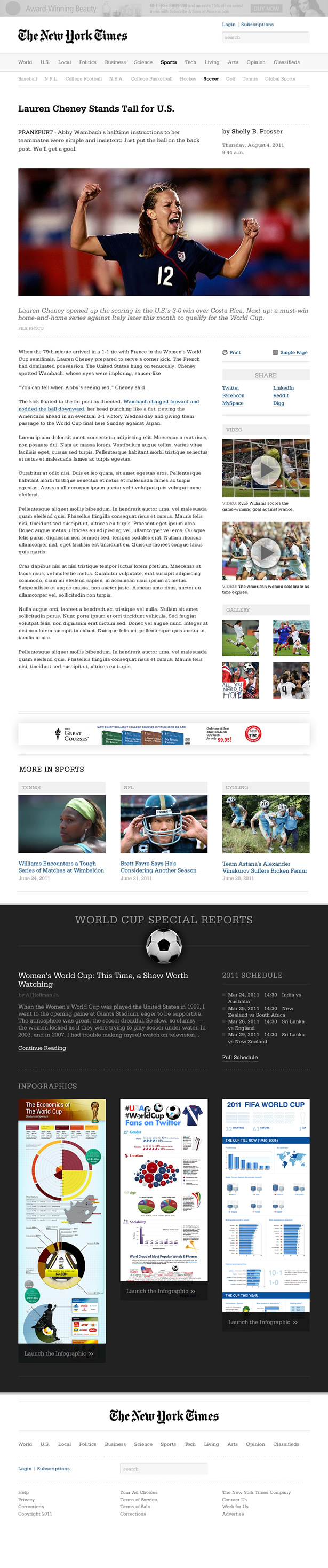
Interesting that the image he uses is zoomed out to the point that it's not readable, ruining his point.
- mikotondria30
I think that the aesthetic of the newspaper experience is going to be with us in some form or another for a good long time yet. He's really comparing apples and oranges I think; to transfer a newspaper from one medium to another, brand and audience is like turning an oil tanker at sea. People, myself included, don't mind what would be perceived as 'clutter' on other sites. We have 30 years of picking up a visually crowded newspaper and scanning, scanning, preplanning what to read, scoping the leads, grazing past the snippets at high speed, and eventually settling down on the page like a nervous bird finding a perch in a tree. Once we've landed, we'll cruise with one eye on one place and another roving - it's a well-honed experience we're familiar with, that we learned as children, and ultimately it's a demographic undercurrent that will the brake on the change of newspapers' online style.
Magazines were always more diverse and cutting edge in terms of their layout. Many more page-turns for less content meant different ways to bring focus and pump the information at people and so it's this style of browsing that lent itself to the screen more easily.
We've already seen so much experimentation and diversity in the layout of sites over the last 15 years, most of us have been responsible for the inception and production of some of the less popular and less successful phenotypes. It will all trend the same way and in a few years the newspapers will look more like this redesign than they do currently, but there is still so much momentum behind brands and the user expectations that it's going to be a long time coming and by dint of the fact that so much time and money will be acting up the design, it'll be far more effective than either.