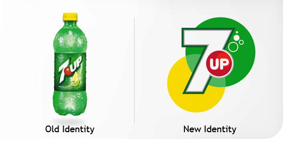
New 7up Logo
- Started
- Last post
- 49 Responses
- dbloc
reminds me of 711
- dbloc0


- http://www.logoloung…dbloc
- it works********
- looks much better on the cans than the plasticmtgentry
- I like it on the cans. middle bottle is kind of cool.mg33
- ********0
- CALLES0
i like it
- dbloc0
bring back the classic logo.

- ********0
I think it's rather good
- Andy_ssw0
First impressions, it works. Nicely done.
- 3030
I see 7 as oddly shaped arrow...
- 3030
@set - yeah, you're right...I've had too much wine
- ********0
- BusterBoy0
Pfft...looks like a TV Station's logo now. Why the need to change classic, clearly identifiable logos?
- desmo0
I like it.
But it sort of reminds me of dish washing soap
- mikotondria30
aw boo - no.
The clinically geometric 7 has lost all the character of the previous one with its curve. I understand trying to arrange the elements more rigourously than then last, but they've nearly finished and the 'board' have said it looks too 'simple', and forced them to add in the detail of the bubbles. A couple of choice subtle gradients and a softening of that main 7 would have given it the more organic look that they've quite awkwardly tried to supplant on in (and failed).
Overall - no.
It looks like the sort of thing I would have designed for a start-up telecom company back in 04.
- benfal990
Approved
- hektor9110
I like!
- randommail0
I like it. It looks European.
- haha, I didn't realize it was actually done in Europe.randommail
- hahakrok
- it stays
bulletfactory
- akrok0
it stays!
- dbloc0
I like it better with the lemon and lime in the background...not the two circles.
- moldero0
who did it Y&R?
- horton0
we've definitely seen worse rebrands.
