DVD cover feedback
- Started
- Last post
- 43 Responses
- Claymantis0
Thanks for the feedback it all makes sense.
I want to do a vintage look, but I dont think he will like it.
- fresnobob0
Definitely looks way more sophisticated.
However it totally says "BENDING THEREAL" now. Watch that space, its way too small. You could probably move the A a little closer to the E too to help out, even if it overlaps, itll be much easier to read and shouldnt look odd since the kerning is so tight anyways. I'd also keep the leading consistent for the title and subtitle, especially since you are using all caps.
- bjladams0
it reminded me of the "... for dummies" book covers
- it looks like a dvd that would be selling for .99 but if the design were good it could go for $4.99SrSamaurai
- 5timuli0
Look into my eyes, look into my eyes, the eyes, the eyes, not around the eyes, don't look around the eyes, look into my eyes. *snap* – you're under...
- Mr_Mxyzptlk0
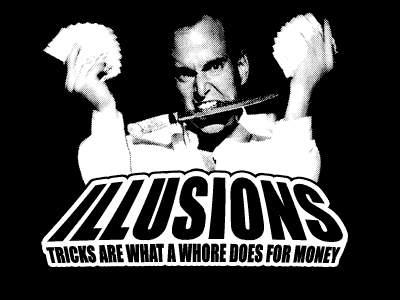
Stick to B&W. The color photo is making him look like a pedophile.
- hahahaha. Good point.Claymantis
- i don't see that at allscarabin
- That's why this post was my post, Scarabin, and not yours.Mr_Mxyzptlk
- i'm not claiming your post, i'm providing additional feedbackscarabin
- settle down sonscarabin
- JSK0
Cheese.
- scarabin0
i like 2 best. in 3 and 4 the type is fighting with his image (on his face no less) and the yellow bar in 1 feels like those "idiots guide" books to me
- brandelec0
go all out, now is your chance
- Frosty_spl0
Reminds me of "In Living Color".
- goldieboy0
2 is the 'better' layout but the colours and font are a bit 'African band' circa 1980. And that photo is just wrong... he's messing with my mind!
- ETM0
So when can I find this DVD in that big $3.99 bargain bin?
- bulletfactory0
food for thought - don't flip the image - he's either married, or not depending.
- nb0
Top right, but make the photo B&W.
- i_monk0
Top right.
Make him black and white.
Make the yellow V narrower so it isn't framing his face.
- a_aachen0
top right. has the best focus

