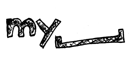
New MySpace Logo
- Started
- Last post
- 30 Responses
- aanderton0
It's not brilliant but lets be honest, it's an improvement.
- raf0

- monNom0
the empty space symbolizes all the users who left for facebook...
- ukit0
I thought the concept of the AOL one was interesting at first, but now that I see it on the site I just don't get how it helps the company in any way.
Yup, it turns out AOL is a blank slate, can be anything you want...well, so what? You're left with the same boring site (apparently Wolf Ollins didn't have any ideas for that part) - only now with a zillion different branding approaches and color schemes so there's no unified feel anymore.
My suspicion is MySpace will run into the same problem. There will be some nice-looking ads commissioned by top agencies, but when it comes time to apply hundreds of different variations of this thing across the many sections of the site, Rupert Murdoch will probably be reaching for his heart medication.
- toe_knee0
I think it's ok. Can be used quite well.
I'm all for a logo that allows us creatives to add our touch to it.
The days of 'keep your shit outside the x height of our logo days are going.

- Gucci0
I don't think it's anywhere near the Gap's level of bad.
I actually don't mind it. Like neowe said, they're trying to branch out and cling to any form of relevance they can. The current logo feels overly generic and lacks any form or style by comparison. I think this is a step in the right direction. Though, it's likely too little too late.
- iceberg0
did ollins do it?
no seriously. I liked the new AOL logo, I like the new my_____ logo, I think both of them are not crap such as the gap logo. seriously, you have to congratulate myspace to this radical move. it might be desperate and their last shot, but its rad.
- neowe0
my_______
my_friends
my_games
my_music
my_whatever...i can see they are using the space to fill whatever of "my" stuff they may want to make prevalent
reminds me of nissan shift as well
- marychain0
conceptual?
for retards maybe.
got it....it's a space....holy shit
it's very obvious and trite no?
- ukit0
Holy crap, I was so sure this was a joke based on just looking at that logo. I was even going to add my own little sarcastic/ironic comment to play along with the charade and whatnot.
- georgesIII0
best one


- babaganush0
Pretty brave and distinctive imo
- It's probably set so they can expand beyond social media and attempt to like apple who own the 'i' prefixbabaganush
- dbloc0
it's way better than what they currently have.

- Tofslie0
its better than the gap. I like the idea actually
- hellojeehae0
this isn't as bad.. but really that designs not gonna make me sign up for myspace
- Is anything going to make anyone sign up for myspace?TheBlueOne
- IF U EVR WANT UR BAND TO $UCCEED MAN YOU GOTTA!!11!nb
- scarabin0
it's conceptual
the first wasn't really, it just ripped off msn chat, didn't it?