Lime logo critique
- Started
- Last post
- 35 Responses
- bukka0
i see a sea turtle, would have not thought of a lime if you didn't tell me
- _niko0
yeah lose the leaves
- FredMcWoozy0
it looks like a rabbit bug.
You could also play off the fruit, sliced. Did you try that?
Fix leaves and it would look better.
- MrT0
A lime with one leaf inside a Q and you've created the incestuous bastard offspring of Apple and Quicktime.
However, I reckon the lime needs to go either more illustrative or more graphic/symbolic. It's stuck in the middle and not clear, as many have said.
I'm assuming you will always have colour too, otherwise what will make this NOT look like a lemon (no pun intended). Does the name include 'lime' as this will help, no doubt.
- monospaced0
may be the Q is the lime itself -- little bulge here, a little bulge there
- SoulFly0
pretty cool
- jay_tuck0
Thanks again for all the input. Once I read "Sea Turtle"... couldn't NOT sea it! Argh... Here are three more variations I came up with.

- sofakingbanned0
on option "C" rotate the lime so the lef replaces Q leg thingie
- monNom0
try a differerent q.
C above (maybe flipped horizontally for balance) might pair well with a tail like these:

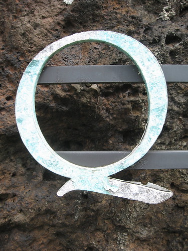

you may need to draw the q yourself to get the right balance, but a zig-zag tail would help ground the mark and balance the leaf.
- fresnobob0
the implied lime slice in version C is cool
- WeLoveNoise0
i think it still needs alot fo work
maybe take some inspiration from what limewire did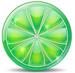
- ali0
the leaves are odd because it looks like they are coming out of the lime not a branch
- trooperbill0
remove the inner lime and have a slide as the tail of the q
- trooperbill0
^sliCe

