AT&T Rebrand
- Started
- Last post
- 39 Responses
- Ramanisky20
^ no worries kid
I work on AT&T Motion Vids all day every day so its kind of refreshing to see that I will have something other than an orange background to work on ... and they are being less restrictive with their logo brand
- stewdio0
Oh man. After re-reading that I'm doubly sorry. Was really just reacting to AT&T now vs. the innovators they once were. I shouldn't have launched that rant anywhere near a discussion about the design of an ad. Apologies!
- FatDude0
like it. go on.
- must_dash0
They are missing one made of macaroni
- MrT0
Maybe it's Google's fault.
"We want our new logo to change all the time like Google's does at Easter or Christmas."
- PIZZA0
Looks like all the brands who turned their logos into marbles 3 years ago are going to be turning them into this sort of crap
- lukus_W0
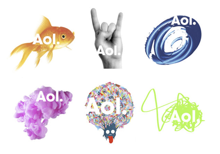
Maybe this multiple mark concept is a display of power? Perhaps only the most powerful corporations (e.e. AOL, AT&T) can get away with it .. because their brands are already so strong and established.
But what's the next step after this? .. how can a large corporation like AT&T extend upon this?
It's almost as if they're de-constructing their established logo .. allowing it to degrade. But what's left once the logo isn't the centre piece of their brand?
If this kind of trend / process is taken to it's logical conclusion, I think a corporation will need to have a pretty strong identity to be able to stay cohesive.
- PIZZA0
and the copywriting on that motion piece makes me want to throw up
- johndiggity0
this has all been road mapped out, starting with the sale of at&t to sbc and then the merger with cingular and given the size of at&t it's interesting to see how all the components are integrated into the overall campaign. the idea behind this step was that the globe was iconic enough to support the brand without the name. kind of like how the apple logo no longer features any verbiage around it.
is it the best example of corporate identity design out there? probably not. but it is a very good example of brand management and not letting the brand get stale.
- I think it's a progression along the road for 'newness'. This was an easy pitstop.lukus_W
- i worked on att at interbrand a few years ago. this was the ultimate goal.johndiggity
- what will they do next though?lukus_W
- well, not quite as powerful as PIZZA - obviously ;)lukus_W
- gah.. that last one should have been ^lukus_W
- dMullins0
It's a rebrand in that they're dropping the "AT&T" wordmark/logotype from all of their consumer-facing advertising. A bold move, but I like it.
As they say in their release, the difference between all of these major companies is thinning out. These companies really have no differentiators anymore, so evolving into an agile mark frees them from being locked into standard pay-off language.
The one thing that bothered me about the TV spot was the birds at the end, which looked a lot like the Blackberry treatment.
- foz0
This just in:
corporate marketing whores are fucking with hungry australian slobs.
http://biomechanic.tumblr.com/po…
- utopian0
If only AT&T would spend some of their time and investors money making their 3G work!
Imagaine the Possibilities...
- Douglas0
the commercial looks like it belongs on Bravo.
- ksv1230
This is feeling positive.
I sure as hell don't like the commercials with that actor in them
- Douglas0
So is this the trend to a redesign these days in going to Interbrand and Wolff Olins? Just a bunch of different treatments to the same logo like AOL or even Pentagrams MAD logo.
- brains0
wow, a lot of big brands are going the way of the flexible mark - a la AOL.
- hektor9110
I was about to set AOL as an example...