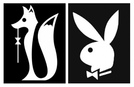
rebranding Playboy
- Started
- Last post
- 56 Responses
- BaskerviIle
A great theoretical project. The thinking, the positioning, the design are all great.
This guy deserves to go places, best work I've seen in a whilehttp://blog.iso50.com/2009/11/24…
- pillhead0
Nice Idea, but I'm not to sure about replacing the bunny with a Fox.
- BaskerviIle0
read the whole blog post
- 10g00
too iconic to lose bunny altogether.
- Bargels0
I like it...but glad I'm not the only one trying to make a shape out of the tail's negative space...
- ItalianStallion0
Fail imo...
- Iggyboo0
That's not his best work. That looks like a skunk the point of the brand is that playboy is connected to what men like the feminine side or aka bunnies. And bunnies ears being split is a sexual reference to something else being split. And bunnies are far more feminine than a fox, men would simply look at it and go is this for the women? Its clear that its more masculine with what looks like an olive stick in his mouth. I like his posters far more.
- are you offended?doesnotexist
- No of course not, :) guys talented. just giving it a review as if it were real.Iggyboo
- OSFA0
Hmmmm Can we make it a little bigger?
- pillhead0
Trouble is if I looked at the Fox logo for the first time it would not say Playboy, it would be unrecognisable as a brand. I'm afraid to say it, but the bunny is a keeper and he should have redesigned the bunny Icon.
- You wouldn't think bunny=Playboy if they hadn't spent decades telling you first.i_monk
- woowah0
i cant be arsed to read the whole thing.
is he actually rebranding it or is it just an excercise?
v surprised if they have ditched the bunny
- Khurram0
Eugh, he was getting AWAY from the overtly sexual connotations.
Read the blog MORANS:
"I imagined a Playboy comprised solely of articles, devoid of nudity (or images of any kind) — something that people would have no choice but to read. In the same way it was regarded as progressive and irreverent in the past, so too could it be now, with an effective and drastic restructuring. Strangely enough, the boundaries Playboy pushed back in the 60’s have now come to be relatively standard operating procedure for men’s magazines. A drastic change, such as eliminating nude spreads altogether, would be one of the ways Playboy could once again be on the forefront exciting editorial content."
- MORANS?woowah
- MO-RANS.Khurram
- Go USA!Douglas
- morans ref for those that need it: http://memewatch.com…jaylarson
- Khurram0
Also, my problem with the "bunny" is that it denotes the sort of feminine qualities that men were into in teh 50s/60s - i.e. fat bitches.
"Bunnies" are fatties, aka, rubenesque, aka voluptious, aka curvy, aka pear-shaped, aka fatties.
All the "playmates" in the pictures of the women in that era dressed as "bunnies" are fatties. That's why none of the modern playmates dress as "bunnies" cos they look like fatties, aka bridget jones.
The fox is much more representative of the slender modern female sexual form propagated in our culture.
Add some DD titties on there and you're good to go!

- BaskerviIle0
What I liked about it was, that he set his brief to move the magazine forward, to make it more like Monocle or something. I think it does that pretty well
- Mmmm, i DO associate foxes with Monocles, ever since Basil teh brush.Khurram
- Douglas0
Funny that you'd tame the magazine and push it into an already dying format. Why not hop on the bandwagon and redesign it digital? There is a pretty large amount of thought that needs to go into why Playboy is dead, and I don't think turning it into a glossy version of Monocle or Fantastic Man is the right decision. I don't mind the idea of losing the iconic bunny because of all the association it carries. Even if the content changes, no on would be caught dead reading it in public, or on a morning commute, etc. Might as well change the name of it as well.
- Iggyboo0
I change my opinion about everything..... Holy shit, I got this all wrong this is a student assignment done by Alex Cornell not ISO. For student work it's pretty damn good. Well done, marketing wise brand wise it's a bit off but for taking a total risk and going ahead and attempting it I congratulate you. You got like 140 comments on that iso50 site talking about this... Clearly you created a buzz. GJ alex's work for the full project can be seen more accurately at: http://www.alexcornell.com/#1967…
- harlequino0
I'm picking up this whole "orifice" vibe with the negative space in the tail.
sort of like...

- Khurram0
Any of you guys seeing a cock in that negative space are latent homos.
- Khurram0
another beef with the bunny, as well as the fact that it promotes fatties.
it's a bit misogynstic/paedophillic portrayal of women - not that that magazine latently isn't, which it is.
But fucking bunnies. That's for little girlies "awww, bunny wabbit!" naiive, simple, BIG EYES, like Betty Boop or Marilyn Monroe, all like "don't ask me! I'm just a little girl!" fuckin paedos.
A "fox" is much more representative of a mature female form - wiley and independent, yet still youthful enough to be worth fucking and impreganting with my cock.
Like for the male archetype it would be A BULL.
This is a symbolic discourse on the redesign, in terms of symbolism.
Add some DD titties on there and you're good to go!
- CygnusZero40
This makes about as much sense as redesigning McD's golden arches. Some things just should not be fucked with, ever.
- flashbender0
I miss having that much free time
- GeorgesII0
stupid.