type of the decade
- Started
- Last post
- 40 Responses
- akzidentist0
Most common: Helvetica. Seconds most common: Helvetica. Most common designed in the last decade: Gotham. Best, in my opinion, designed in the last decade: right now I must say Nara.
- I think you had a seizure. This thing is Nueva with a little Times New Roman. Please put it back where it came from.Amicus
- I disagree :D sorry, But Nueva is not a good typeface. I really like Nara thou, beautiful construction, double italic concept - very innovative. but most of all makes a nice set overall in terms of visual grammar.akzidentist
- concept - very innovative. nice tool for strong visual grammar.akzidentist
- version30
helvetica is only superior like apple is... in the minds of the users, not in pure numbers of reality. gotham works overtime. just because it wasn't hipster trendy for the last 3 years doesn't mean gotham isn't used in every city for the last decade. also it doesn't come installed on your shiny new status symbol
- besides helvetica is 52 years and needs to sit down before it gets hurtversion3
- fucking arial elitistversion3
- Helvetica will kick Gotham's ass any day.monospaced
- gotta side with mono here.baseline_shift
- Helvetica does have a beautiful lowercase. Gotham's lc looks a little inbred to me.Amicus
- SoulFly0
The one I think will be remember from the past 10 years is Comic Sans
- monNom0
Early: Avant Garde, Trade Gothic (especially for random numerals), DIN, Cooper Black for a few months at least
Mid: Clarendon, Rockwell, Myriad/Frutiger, vag rounded, Futura
Of late: Gotham Bold , Gotham Light, Georgia occasionally, Gotham Regular
- version30
see what happened to helvetica...
http://www.webdesignerdepot.com/…
trendy just to blog about it- though it's been determined that blog is a failure floatingversion3
- that header discounts this site as a viable voice for designbaseline_shift
- so should all the inaccuracies within the contentversion3
- version30
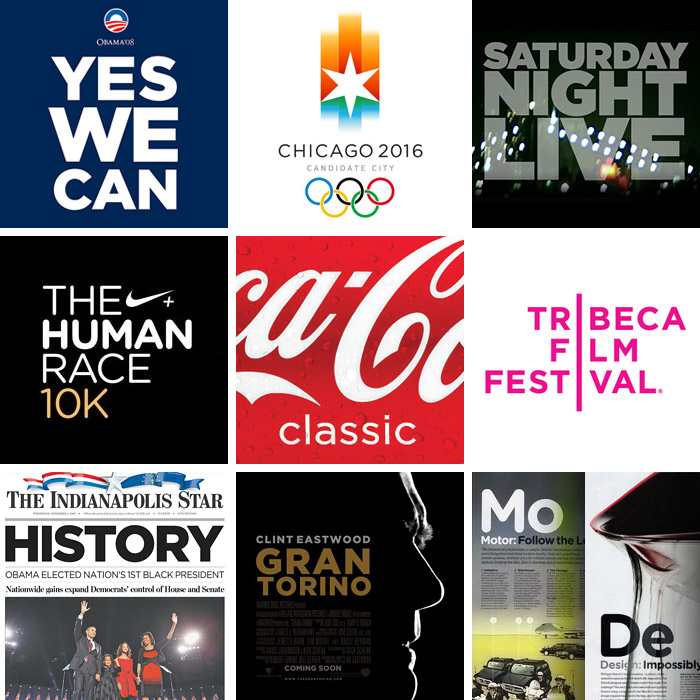
The conversation about the origins of Gotham didn’t make it into the film, but was included among the 41 bonus features on the Helvetica DVD. I’ve posted part of the interview above. Watching this clip, I think it’s interesting that the design of Gotham was influenced by early Modernism, another movement that was about change and social idealism. And I like that the design aesthetic that may help move Obama into the White House was inspired by the humble NY Port Authority Bus Terminal sign.
- johndiggity0
another trend: the whole herb lubalin/tom carnase revival—avant garde, grouch, serif gothic, busorma.
i think ed benguit will be next.
- utopian0
GOTHAM
- johndiggity0
gotham. no question.
- version30
before opening the thread i had the same gotham answer. does anyone want to reveal why they chose that?
- Obamamonospaced
- i blame obama, though it was prevalent before thatversion3
- well looky there ;)version3
- and every wedding invitation designed in the last two yearsmonospaced
- luckily not the ones i heldversion3
- ukit0
- And the winner is...Gothamukit
- awe man, did you just end your own thread?monospaced
- I like to wrap these things up quicklyukit
- It is a handsome font.stoplying
- version30
Every designer has admired the no-nonsense lettering of the American vernacular, those letters of paint, plaster, neon, glass and steel that figure so prominently in the urban landscape. From these humble beginnings comes Gotham, a hard-working typeface for the ages.
Gotham celebrates the attractive and unassuming lettering of the city. Public spaces are teeming with handmade sans serifs that share the same underlying structure, an engineer's idea of "basic lettering" that transcends both the characteristics of their materials and the mannerisms of their craftsmen. These are the cast bronze numbers outside office buildings that speak with authority, and the engravings on cornerstones whose neutral and equable style defies the passage of time. They're the matter-of-fact neon signs that announce liquor stores and pharmacies, and the proprietors' names painted majestically on the sides of trucks. These letters are straightforward and non-negotiable, yet possessed of great personality, and always expertly made. And although designers have lived with them for half a century, they remarkably went unrevived until 2000, when Hoefler & Frere-Jones introduced Gotham.
Gotham is that rarest of designs, the new typeface that somehow feels familiar. From the lettering that inspired it, Gotham inherited an honest tone that's assertive but never imposing, friendly but never folksy, confident but never aloof. The inclusion of so many original ingredients — a lowercase, italics, and a comprehensive range of weights — enhances these forms' plainspokenness with a welcome sophistication, and brings a broad range of expressive voices to the Gotham family.
- johndiggity0
i realized it when i saw it being used on a quickie "specials" vinyl sign in the cafe in the basement of my office building.
- dopepope0
seems more like it's just the last 2-3 years or so that Gotham made it's real impact of the decade.
- Josev0
Yeah, I think Gotham is recent. It's still relevant.
I was trying to remember what the typeface of the 90's was. I always think of Meta but that came at the end of the 90's.
- identity0
Cholla
Fedra
FairplexI also remember being exceptionally popular - but will they be remembered the same way Gotham will be in 10 years... I think not...
