type of the decade
- Started
- Last post
- 40 Responses
- ukit
I realize this "of the decade" shit might be getting old, but here's a serious design thread.
What typefaces do you think were the best of the past 10 years and which do you think will be remembered 10 years from now
- utopian0
GOTHAM
- johndiggity0
gotham. no question.
- version30
before opening the thread i had the same gotham answer. does anyone want to reveal why they chose that?
- Obamamonospaced
- i blame obama, though it was prevalent before thatversion3
- well looky there ;)version3
- and every wedding invitation designed in the last two yearsmonospaced
- luckily not the ones i heldversion3
- ukit0
- And the winner is...Gothamukit
- awe man, did you just end your own thread?monospaced
- I like to wrap these things up quicklyukit
- It is a handsome font.stoplying
- version30
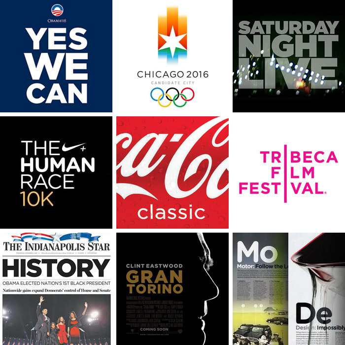
Every designer has admired the no-nonsense lettering of the American vernacular, those letters of paint, plaster, neon, glass and steel that figure so prominently in the urban landscape. From these humble beginnings comes Gotham, a hard-working typeface for the ages.
Gotham celebrates the attractive and unassuming lettering of the city. Public spaces are teeming with handmade sans serifs that share the same underlying structure, an engineer's idea of "basic lettering" that transcends both the characteristics of their materials and the mannerisms of their craftsmen. These are the cast bronze numbers outside office buildings that speak with authority, and the engravings on cornerstones whose neutral and equable style defies the passage of time. They're the matter-of-fact neon signs that announce liquor stores and pharmacies, and the proprietors' names painted majestically on the sides of trucks. These letters are straightforward and non-negotiable, yet possessed of great personality, and always expertly made. And although designers have lived with them for half a century, they remarkably went unrevived until 2000, when Hoefler & Frere-Jones introduced Gotham.
Gotham is that rarest of designs, the new typeface that somehow feels familiar. From the lettering that inspired it, Gotham inherited an honest tone that's assertive but never imposing, friendly but never folksy, confident but never aloof. The inclusion of so many original ingredients — a lowercase, italics, and a comprehensive range of weights — enhances these forms' plainspokenness with a welcome sophistication, and brings a broad range of expressive voices to the Gotham family.
- johndiggity0
i realized it when i saw it being used on a quickie "specials" vinyl sign in the cafe in the basement of my office building.
- dopepope0
seems more like it's just the last 2-3 years or so that Gotham made it's real impact of the decade.
- Josev0
Yeah, I think Gotham is recent. It's still relevant.
I was trying to remember what the typeface of the 90's was. I always think of Meta but that came at the end of the 90's.
- identity0
Cholla
Fedra
FairplexI also remember being exceptionally popular - but will they be remembered the same way Gotham will be in 10 years... I think not...
- ukit0
I guess you could also say Gotham was the best executed example of an overall trend. I'm sure there are dozens more you could make a case for though.
- identity0
and while not designed in the 2000's - Times New Roman experienced something of a rebirth toward the latter end of this decade.
- identity0
and while not designed in the 2000's - Times New Roman experienced something of a rebirth toward the latter end of this decade.
- ********0
Gotham is the new Helvetica (TM)
- Why trademark that quote? Is it that important of a quote to be trademarked? Really?non
- T-Shirts!********
- neue75_bold0
what a surprise all those designs [save coke] use all caps...
- BECAUSE THE LC IS FUCKING UGLY..neue75_bold
- I second this.Amicus
- noneck0
In the early 2000s you'd see lotsa Avenir.
- neue75_bold0
Arial, Verdana & Georgia..
