Melbourne Brand
- Started
- Last post
- 33 Responses
- ********
Anyone know who did this?
- utopian0
pretty lame for $260,000

- 5timuli0
L-L-L-Landor.
- quamb0
"The Melbourne branch of multinational company Landor created the brand"
I like it.
- utopian0
Did they find the "M" on ffffound?
- ********0
Yeah, I dont mind it.
- tOki0
are we reliving the 80s or something sigh
- airey0
yeah, but the figure they usually tell is for a complete branding and specific roll-out. the comm bank here did the southern cross branding about 15 or so years back and the papers mentioned a several million bucks but that included the signage, atm faces, bank livery, uniforms, the whole lot, not just a jpg emailed to the bank with an invoice included.
the figure for the 'm' won't be for a: 'logo, business card, letterhead and a jpg for your myob invoices' (usual for my small clients) ffs.
this site used to have professionals in it but more and more the knowledge base seems to be 20 years olds who have almost finished their community college certificate in visual communication.
- You don't say...5timuli
- i'll have my certificate 2 in 'visual crapery' by june next year. exciting...airey
- I got mine already. I'm onto Radiator Science next.5timuli
- 'balloon static green-energy' is on my dream list. the employment ops are limitless from there...airey
- I might spend the year drinking Buckfast and White Lightning like the normal folks who do those types of courses.5timuli
- hahahaairey
- BusterBoy0
Must have been some direction to tie it in with Fed Square?
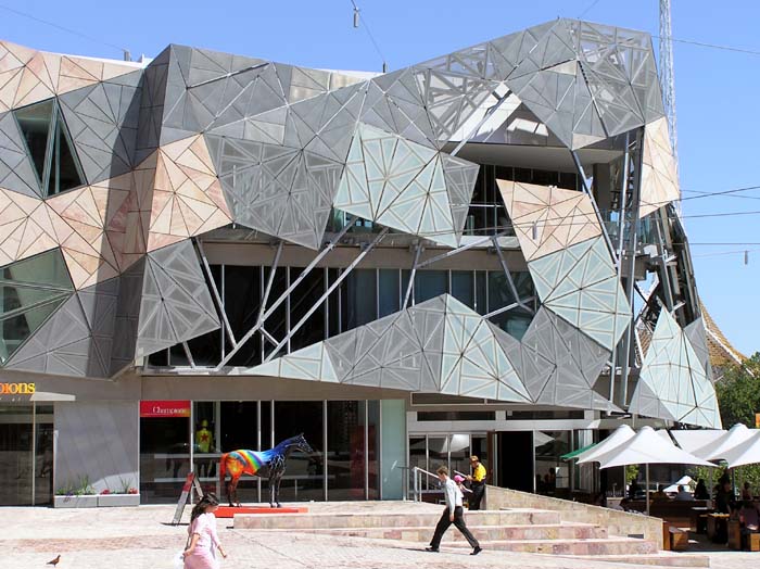
Apparently our new city tag line has been changed from Melbourne - Teh place to be" to "Melbourne - City of Geometric Shapes!"
- Amicus0
I'd like to see more pics of it in use before I make a judgement, but so far it looks like this:

+
- i just threw up in my mouth a little.airey
- the us virgin is looks like he's a the kind of virgin that lives with mum and collects homoerotic art.airey
- have you read the back story (or seen the stilt walkers that act out the story??)Amicus
- hah.akrokdesign
- the virgin islands type looks like it's moving... IT'S MOVINGGreedo
- Amicus0
Melbourne - You'll love all it's Facets.
- akrokdesign0
oh well, it could had been much worser, like example: london 2012. aaaaaaaaah.
- true... true.
though i think this came from the same batch of acid – 'mustn't look too stoned - must stick to the grid..."Amicus - 'mustn't look too stoned - must stick to the grid..."Amicus
- aaaaaaaaaaaaaaaaa
cccccccccccccccccccc
iiiiiiiiiiiiiiiiiiii...
ddddddddddddddddakrokdesign
- true... true.
- akrokdesign0
in case you have forgot the worst one...ever.

- yeah, it's not got any better to my eyes. although my eyes are behind an inch of glass and 35 yrs of bitternessairey
- hah. even HAPPY ORANGE, ain't working.akrokdesign
- friends don't let friends wear orange. true story.airey
- akrokdesign0
if the new "m" replacing this?

- neue75_bold0
could be worse...
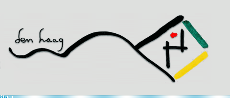
- the logo incl. driving directions. sweet.akrokdesign
- as long as you start at the right placeAmicus
- or is it a kite? cross stitch pattern? someone forgot how to draw a tic tac toe grid?Amicus
- it's actually Arabic for "the city of bureaucratic nightmares"neue75_bold
- Amicus0
melbourne's visual branding has been incredibly fractured - perhaps this is a visual joke riffing on that idea???


http://tbn2.google.com/images?q=…

- ********0
i like it


