Logo Crit Please
- Started
- Last post
- 52 Responses
- max_prophet0
this idea has been used a million times, usually for socially conscious / community / third sector initiatives.
As mentioned before, the 'idea' is working the wrong way around, you collecting not sharing.
Also, the type is awful, looks tacked on and terribly kerned.
- _salisae_0
to be fair, i haven't seen a case where you've really taken constructive criticism, scotch. you seem to just wait until someone posts a comment that you agree with.
- version30
my first thought... "Sheriff"
- skt0
unlike you utopian i don't feel the need to sign up numerous fake accounts in order to rubbish other peoples work and call them gay (is there something wrong with being gay by the way?)
now if you think my contribution to this thread was born of hate, that's fair enough. it wasn't, but you're not very bright and entitled to an opinion.
now have you not got something to put at a 45 degree angle back in bum fuck nowhere?
- jimzyk0
i like
but the type is way too small in relation to the mark.
look at twitter down there. ----->
over there ----|\\\> that way kind of..now theres a logo
- brains0
This is by far, the most intense logo crit thread I've ever seen.
- neverblink0
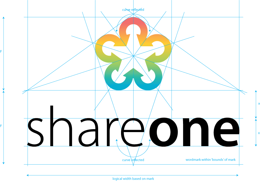
Without going into the shape of the logo itself, (I believe it has been mentioned enough that the arrows should probably point outwards) I have made some visual comments on the ratio between the shape and the wordmark.
- MondoMorphic0
It is pretty!
- MondoMorphic0
hahahaha - indeed! Maybe that means the logo is either *that* good or *that* bad. :)
- typist0


- that's a bit unnecessary don;t you thinkmax_prophet
- Wow, some of those are REALLY old! The Skevos and CoreSource ones were from 1997!! hahahaMondoMorphic
- it seems your typographic approach and skill is still the same in 1997 as you were?
i think journyc has a pointtypist - you seems like to space out the kerning and justify for every logotypist
- the mark and the typeface is always not matching togethertypist
- utopian0
nice
- rosem0
The idea is fairly first level, but I like the mark. Maybe try combining the arrowheads where they meet—they look a little thick right now.
- skt0
first thought was face first into the propeller.

- and that the balance between the mark and the type was wrong...skt
- http://i253.photobuc…utopian
- not really... they bare more than a passing resemblance.skt
- I always liked JK'sOSFA
- different business, different shape.. if you call that resemblance you can disqualify a lot more logo'sjanne76
- some people are so anal here about things you'd become paranoid of it.. jesus..janne76
- fucking hell janne, it was only my first thought... i didn't call rip or anything.skt
- Dancer0
^ skt is right but I think that may have something to with the colour.
Ilike the mark but needs much more refinement. Also the type is a little apologetic.
- skt0
any resemblance to other marks is a moot point anyway as yours, as read, is saying collate many into one, not share one with many. your arrows should be moving out from a single point.
- MondoMorphic0
Yeah, I'm sure there are bunches of logos that feature the shape of a star formed out of other objects. ;)
Dancer - what do you feel would make the type stronger?
- WeLoveNoise0
could spend all day on here posting star like logos. not the most original idea any designer has ever had but i do like your design.
it does reflect the company name well but i think the typeface needs alot more work at its not working well with the mark.
- and you could spend all day thinking the mark actually made sense.skt
- and u cud shut the fuck up for onceWeLoveNoise
- oh dear, are we going to do this again... he asked for a crit, i gave my first reaction followed by a considered response...skt
- response... maybe i should just stick with 'type needs work'skt
- wasnt referring to ur crit - thought it was right. but combined with the company name i think the mark does make senseWeLoveNoise
- make sense.WeLoveNoise
- if it was for data aggregation it would, but this is for propagation, the opposite.skt
- i thought i was just aggregation. in which case does need alot more work doing to it.WeLoveNoise