Logo Crit Please
Logo Crit Please
Out of context: Reply #52
- Started
- Last post
- 52 Responses
- neverblink0
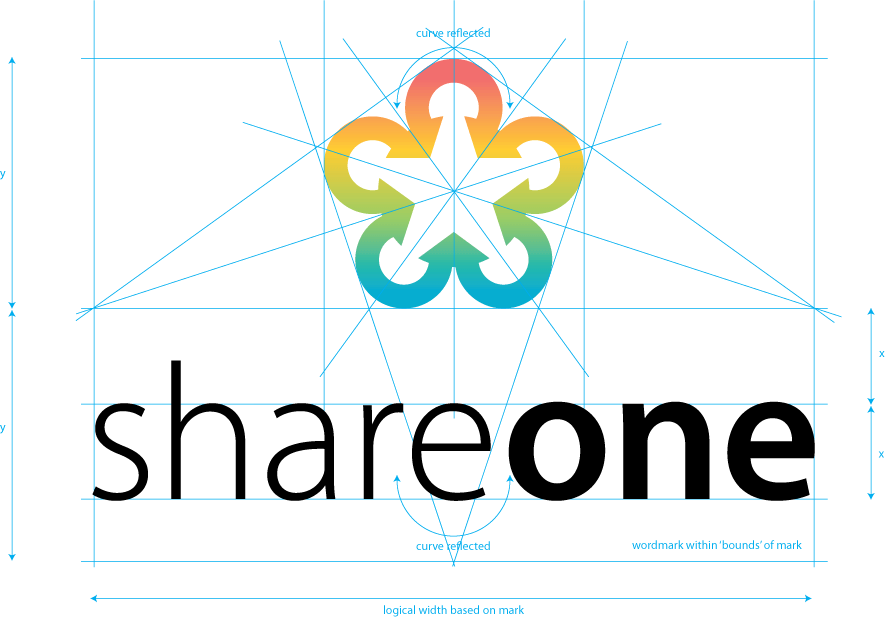
Without going into the shape of the logo itself, (I believe it has been mentioned enough that the arrows should probably point outwards) I have made some visual comments on the ratio between the shape and the wordmark.