Fonts you hate
- Started
- Last post
- 14 Responses
- stewart
Sometimes I hate a font for one small detail. Like the t from Futura that looks like a cross.
Which fonts do you not use because there is a specific detail in them that you really dislike?
I'm thinking about making a font that has all those details that I hate, but try to make it a nice font as a whole.

- _niko4
so many things annoy me about Futura but it somehow works as a whole
- This was my early days, anti Helvetica "art/design school" love affair font.
It's lovely, timeless and edgy!!!
: )ideaist - futura is a near perfect font. ok these days the x height is too small, but more modern versions end up looking blandhans_glib
- Futura is usually the first sans family i reach for. So many options!scarabin
- Neutraface and Neutraface 2 replaced Futura in my use. Gave me more stylistic options.uan
- I love futura, but it's .. quirky, and it really doesn't like having strokes added to it. I love looking out for glitched Vs and Ws in other people's work :)Nairn
- Future is like your goofy friend. You see his flaws but accept him anyway.CyBrainX
- you mean the
BIG
RED
TEXT font... not awful just uninventiveArchitectofFate
- This was my early days, anti Helvetica "art/design school" love affair font.
- tank02-4
Hate the game, not the player
- shapesalad0
Helvetica R
Wish it went straight, starting from 61.8% of the – length of the middle line and going straight down like this: \
Instead of that odd curve.

- Like Arial?monospaced
- I like the R in Helvetica. It's how I spot it for sure.CyBrainX
- not like Arial- they do it wrong, Arial is slightly curved and all ugly.shapesalad
- Arial has a weird messy curve. Eech. https://www.marksimo…jagara
- Maybe Akzidenz Grotesk is your jam: https://upload.wikim…jagara
- grafician-8
It's silly to hate typefaces when there's so many of them, for any type of project you can think of
Just sayin'
- Nairn0
"I'm thinking about making a font that has all those details that I hate, but try to make it a nice font as a whole."
Love this! DO EEET.
- Continuity1
I'm not overly fond of Gotham, but not because it's ugly. Just because of its former ubiquity.
One I loathe, though, is this one. It's uglier than a jar of pickled arseholes.

- That 5 looks like Jay Leno's chin.Continuity
- or Trump's pantaloonsCyBrainX
- I would never have guessed this was Gotham. It looks pretty bad and I usually like it.CyBrainX
- It's not Gotham, no. I name-dropped it first, but it bears no relation to the turd that followed.Continuity
- grafician-2
OK. Fine. Noto.
Open Sans.
Roboto.
- Mostly Google fonts, having that "engineered" look, cold, calculated, boring, android ishgrafician
- dude, don't you know it's silly to hate typefaces. it's '22, you have millions of free alternatives for any typeface.uan
- No hate, just not using them. And no, usually free fonts are crap with very few exceptionsgrafician
- Well, if we're going to go down that road, we might as well call Arial out for being one of the all-time worst. This shit is ugly as sin.Continuity
- Yes, some of the system fonts are atrocious toografician
- imbecile3
anything face or family not made thoroughly by a professional.
I have made personal fonts in the past, i hate those fonts, too. Incomplete either in setting, spacing, kerning pairs, etc. or just not all the characters.
I hate when I'm trying to get a font to work for a project, then you realize a few needed characters are missing or it is just another character thrown in flipped or rotated without regard for usage.
it is quite a pleasure to use a well designed and functional family
- any*imbecile
- I hear you. Crafting a totally effective font is a huge undertaking. Much more-so than you would imagine if you haven't tried before.CyBrainX
- i consistently tell clients to spend hundreds on fonts instead of free fonts. I appreciate the versatility and hope they appreciate the resulting qualityimbecile
- CyBrainX4
Most of these fonts have problems but I don't hate them. There was a system font on Mac before OSX that was the default substitute if you were missing anything. Chicago. I still see it every once in a while. The capital M in this font is painfully unacceptable.
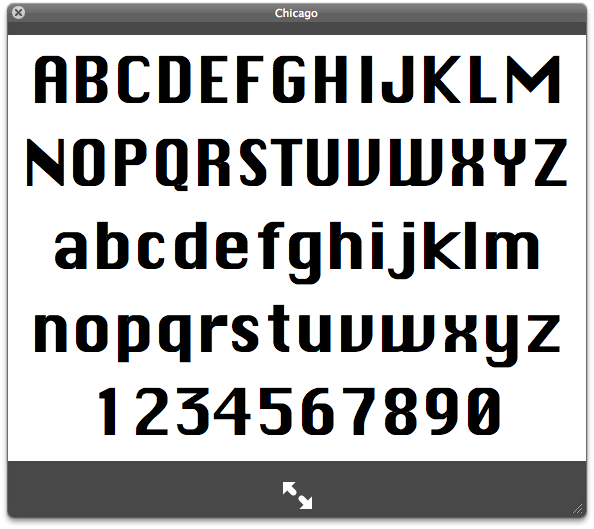
- That 0 could also go to the Punches For thread.CyBrainX
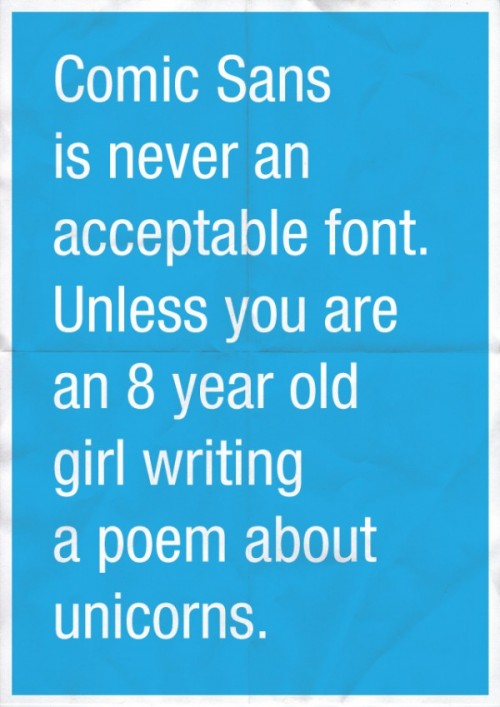
- worse than comic sansshapesalad
- I remember hating this typeface on the Amiga back in 92 or so, entirely not understanding its history and provenanceNairn
- Given the choice between having to look at this one or Comic Sans all day on an interface, I'd go with this one. This one at least pretends to be serious.Continuity
- Comic Sans on an interface would have to be a joke, even if it were done by someone who wasn't a designer.CyBrainX
- this worked well on low res screens, but it was ugly stillmonospaced
- The one nice thing about this was that if you were missing a font, there was no doubt you had to take care of it immediately.CyBrainX
- nb3
1. Duplicate Arial font files
2. Rename it something cool
3. Design an ultra cool microsite. Use pure black and white, lots of animation, full screen wipes, flashing stuff
4. Charge design noobs $30 to download it
- Continuity4
Saw a billboard today featuring this fucking abomination. Kill it before it breeds.

- it is everywherested
- this one is just released 2 days ago: https://typecache.co…sted
- Ugh. Hideous.Continuity
- Oh shit, I tried to use this a while ago for an online magazine I was pitching for. What the hell was i thinking?!Ianbolton
- *shrug* I like both.Nairn
- yeah, i've seen worsescruffics
- Ianbolton2
Barmeno.
This was a font I used years ago for a brand I can't actually remember. It was okay for maybe a week, but eventually it ground me down to pure hatred.