New Mastercard Logo
New Mastercard Logo
- Started
- Last post
- 16 Responses
- set0
Like it
- friend0
I would change the name writing to Mastercard not mastercard or MasterCard. I would put the name in a rectangle outline.
- LameKidsClub-3
Like the simple shapes, not into that lowercase font.
It looks hella generic to me.- That's the point.monospaced
- woof.LameKidsClub
- meowmonospaced
- sureshot1
nice circles.
- dbloc0
It just looks weird without nipples.
- bainbridge0
I like it, but so simple.
- bainbridge0
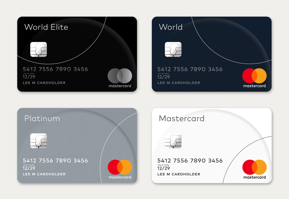
How come metallic one has gradient but colors do not?
- PonyBoy0
<3 it... simple and instantly recognizable
- monospaced0
It has a lot of similarities to the '60s version, with the flat design and lowercase type. Makes sense.
- CygnusZero4-3
2 circles lmfao. the previous was self-contained. it was a stronger logo. now you need this weak copy below it to even know what it is, you know, BECAUSE ITS JUST 2 CIRCLES.
- actually, I'd say most people would recognize it without the typemonospaced
- stoplying1
You ain't MY master!