Design do's & don'ts
- Started
- Last post
- 20 Responses
- Projectile
I'm writing a 2-page guide (as part of a tutorial on presentation design) for non-designers and want to list the basics like using colour, information hierarchy, use of white space etc.
Are there any brief guides out there?
What are your top things to tell the riff raff?
- autoflavour0
1) dont sleep with co-workers
2) Black is the new black
- autoflavour1
and buy this
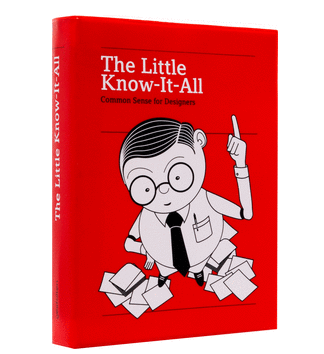
- I saw this at the bookstore a week ago. Almost picked it up.pinkfloyd
- Is that spine title the correct way up?Ianbolton
- haha upside down spine! If I made that mistake, I'd tell everyone I did it on purpose so that it stands out in a stack of books.nb
- its pretty useful.. you could read it cover to cover and pretty know everything you need to knowautoflavour
- except of course how to design..autoflavour
- grotesk_neue0
This will be a really tough one. No non-designer will understand what you're trying to tell, especially only based on a 2 page presentation. Learning design for non-designers will take a lot more...
Even if you tell them explicitly to not use Comic Sans and dropshadows etc. they will, because they think it's cute.
Good luck.- I'm sorry, I would love to help, but this is nearly hopeless. Teaching them would take a lot more time and effort than a 2 pager.grotesk_neue
- antimotion0
Guy Kawasaki 10 20 30 Rule
- Maybe you should do it like this guy. Give them very strict, low-level limitations, so that they at least don't fuck things up.grotesk_neue
- fuck this douche and fuck his shitty ass
canva._niko - consultant to the bozosomg
- pinkfloyd-1
don't make the logo bigger
don't make it pop
- yurimon-1
find a good template and use it.
- MrT1
Don't do design : )
- monNom-1
Always end with a joke.
- utopian-1
Don't bang your design intern and then make her a partner!
- Sagmeister 101omahadesigns
- Because that isn't working out well for them at all. :/monospaced
- omg3
Just a rough list in how the basics of design should start...
1. problem
2. people
3. solutionA design might not have any information, color or whitespace.
- scarabin0
take it to where it needs to be, then take it to the next level.
or further.
in fact, push the envelope so hard it says "excuse you"
- cannonball1978-2
1) You don't have taste just because you think you do.
2) Get a designer to look at it.
- omahadesigns1
Use a grid.
Don't not use a grid.
- omahadesigns-4
Don't use Orange and Gray together.
- omahadesigns1
Stop using Bank Gothic in movies.
http://bankgothiceverywhere.tumb…
- omahadesigns0
- Is this a do or a don't?kalkal
- It's a how to do.omahadesigns
- MrT0
What about a page or even two of brilliant examples?
Even after reading all the rules on something like this https://designschool.canva.com/b… one could really mess things up...
- hotroddy0
to start - look at similar bodies of work and try to modify/replicate according to your needs.
after enough copying/plagiarizing - you will have built the skills to create original work.
this is how I learned.
- sarahfailin1
1. register for an account on qbn
2. don't make jokes about cancer
- _niko0
bretba$h the shit out of everything