Tokyo 2020 logo
- Started
- Last post
- 62 Responses
- kalkal0
Beats this crap.

- are you sure?docpoz
- Very sure.kalkal
- not hard to beat thisdoesnotexist
- http://mw2.google.co…nb
- this is a million times betterfadein11
- zoinyurimon
- zionyurimon
- 20 = (6x3)+2
12 = 6+6
OMG ILLUMINATIdetritus - yeah thats shittymoldero
- nup, 2012 branding was brilliant, imshodetritus
- This is not crap...this branding is awesome.see_thru
- Lisa Simpson giving headzarkonite
- i found that funny (no pedo)docpoz
- this worked so well across the whole games, it was created with motion / digital in mind for the first time for the Olympics and nailed it. A refreshing change.fadein11
- Hmmm...nomarychain
- Was very good in my opinion.HAYZ1LLLA
- yuekit2

- <GeorgesII
- The closing ceremony should be interesting...face_melter
- This. Is. Awesome.SteveJobs
- THISdocpoz
- Whatever this is, I worship it.
(I should put that comment in the religion thread)CyBrainX - Kaaaaneeedddaaaa!prophetone
- Tetsuuuuoooooooooo!gilgamush
- Kaiiiiiiii!OBBTKN
- nicemoldero
- futuremongolian1
Olympic logos are always terrible.
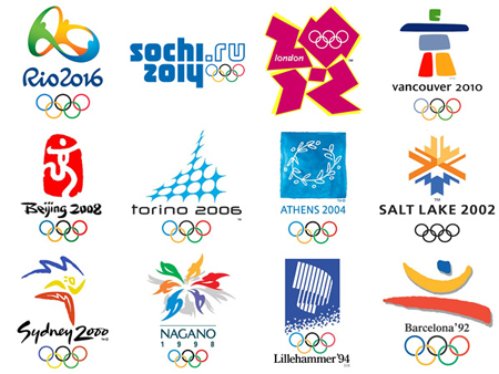
- beijing and sydney are ok.iCanHazQBN
- problem with Tokyo logo is they're playing with the first letter of the word (T). Why? Why is designing around the first letter of a word a "thing"?iCanHazQBN
- There's so much humanity and inspiration to design with in an Olympics logo, and all they can do is design a "T"?? So uncreative and lazy.iCanHazQBN
- There may be a meaning in the "T" (I don't know), but this logo is for the general worldwide public. They don't care about hidden meanings...iCanHazQBN
- ... They just want to be inspired and feel some sort of human spirit in the logo. The Tokyo logo fails in every sense.iCanHazQBN
- still not as bad as Sochi. Which is an URL.futuremongolian
- lol @ Sydney being okay - crock of shit.fadein11
- London by far the best out of all that generic shit.fadein11
- London is still eligible. It became trendy to like that logo. It was fun in applications, but standing alone it's still very confusing.iCanHazQBN
- London Epic Failutopian
- Vancouver speaks of the place, London of the time.. The others are cryptic as shit.zarkonite
- does sochi even count as a logo if can be done in ms word?zarkonite
- Sydney is one of the worst.marychain
- London, Beijing, Vancouver and Salt Lake are all perfectly fine you tossermarychain
- it's the first letter of T-okyo... are you all retarded? though this graphic design exploration sucks, it's as deep and meaningful as any other.doesnotexist
- No shit it's the first letter. So what? it's the ultimate form of laziness just grabbing the first letter of a client and designing around it.iCanHazQBN
- So what if it's starts with a T? Does a T represent Tokyo as a country? Does it represent the human/athletic spirit of the Olympics?iCanHazQBN
- Sydney is shit. It was 10 years out of date at the time. All that painterly generic positive Wolff Ollins shit is and always was shit.MrT
- Ummm. Where is https://en.wikipedia…HAYZ1LLLA
- set3
So this Olivier Debie guy that designed the theatre logo that is very similar has officially sent the designer of the Olympic logo a letter demanding a response to his allegations that the Olympic logo is a plagiarism of his.
Does anyone rise think that is incredibly petty, pathetic and narcissistic? It's a basic fucking shape mate, get over yourself. To officially call the guy out like that is a real dick move...
- I sorta agree but these things are very different when they happen to you, chances are you'd feel the same in his shoes.spl33nidoru
- Non Paywall Article from Guardian:
http://www.theguardi…detritus - And no, Olivier shouldn't've raised a peep, silly pompous Belgian that he is.detritus
- Yea sorry I moaned about having to sign up to read that article the other day and then forgotset
- no paywall - just register to view article.fadein11
- Ok, so 'Non-walled' then? Same diff.detritus
- wat?
'Walled-off' evendetritus - Have a to sign up, won't do that for just one articleformed
- I said the same thing, but it kept cropping up on my twitter feed and I wanted to read it, so I gave in. But yes, it's bollocks.set
- Though, formed, detritus did provide a link in note #2, but thanks for your input.set
- Consider it noted, and thanks again. Do pop by again soon.set
- nb5
- better.fixedArchitectofFate
- good luck with fixing it for 2023Krassy
- whatthefunk0

- huh?ArchitectofFate
- Year one after the pandemic?OBBTKN
- Awkwardwebazoot
- 2021omahadesigns
- 2020 NEChimp
- 202 ONEhelloeatbreathedrive
- NBC's Olympics coverage logo but not officially by the Japanese organizing committee me thinks...whatthefunk
- set0
5 minutes in illustrator
- you sound like a non-designer :)fadein11
- that's being kindformed
- what a fucking stupid thing to say, setpressplay
- Amateursset
- jesus, set, you are so dumb! fucking christ.doesnotexist
- it probably took 6 minutesdoesnotexist
- call the fucking waaambulanceset
- Haha. Sets trolling powers are growing by the day. Who's he had a fight with today?HAYZ1LLLA
- sephil-2
So what QBNers think about the remaining 4 candidates?
Probably not a victory for crowdsourcing?
details: https://tokyo2020.jp/en/games/em…
- Not again.
http://www.qbn.com/t…ORAZAL - Get in touch with darkslateblue. I'm sure he'll have a lot to say about it.ORAZAL
- http://myfirstbookof…ORAZAL
- Not loving any of them but I think a is the most unique and has the potential to do great things in an overarching brand system_niko
- oh dear... tho to be fair they're about the usual standard of olympic logos
especial lols at chunky athlete (c)hans_glib - The "C" looks like a man jugglingsephil
- At a severe push, probably D - mainly because it isn't another fucking half-assed brush stroke motif.face_melter
- C looks like a giant baby being tickled.face_melter
- D is quite nice.monospaced
- Not again.
- EightyDeuce0
Uh Oh.....
The Rip-Off Controvesy Over the Tokyo Olympics Logo
http://kotaku.com/the-rip-off-co…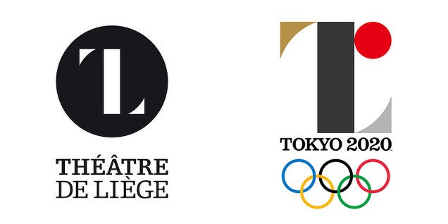
- Haha. Terrible and a rip.docpoz
- I didn't think the "L" made sense for the Olympicsmonospaced
- So tired that a basic shape is a rip. I recently did something similar, and i didn't see any of these...tank02
- Yea I wouldn't call it a rip. Sure it's the same shape but it's as basic as fuck. There are 7 billion cunts on the planet, of course this is going to happen.set
- jerk2
and the winner is...
- ArchitectofFate1
It's gonna' suck. bigtime. seriously 2 weeks...
Great article on the subject
https://medium.com/@ianlynam/why…
- teh0

- At least they had the decency to cover the anus...face_melter
- Why is their porn always so borderline rapey?monospaced
- ^ racist2002
- not in the slightestmonospaced
- BrokenHD0
http://www.tokyo2020.jp/en/emble…
https://twitter.com/Tokyo2020/st…
Amidst plagiarism accusations of the 2020 Tokyo Olympics logo, the organizers have taken to the public for a new design. While designer Kenjiro Sano refuted claims of the art copying the Belgian Théâtre de Liège, the committee has nonetheless decided to replace the controversial logo. Announcing the news via Twitter, the contest depicts democratization in a world that’s all-embracing of the new shared economy. While individuals must be a Japanese national or foreign national with the right of residence in Japan, group submissions require just one person to meet the nationality requirements. The public competition begins November 24 and ends December 7, 2015, with the winner being announced Spring 2016. For full details, visit the official Tokyo 2020 website.
- Mmm, crowdsourcing.BrokenHD
- This will end well. Commence Operation: Cock and Balls Flood in 3... 2... 1...face_melter
- LOL @ an organization concerned with plagiarism turning to crowdsourcing.monNom
- docpoz0
"Doc Poz version 1.1"

- So it will have your name in it?youngdesigner
- it's a watermark, plz ignoredocpoz
- couldn't even make the 'O' round eh?lambsy
- haha... no fucks givendocpoz
- detritus0
Well I never.
http://www.theguardian.com/world…
I suppose the decision's understandable given how protective The Olympic Cartel is of their branding, but I really don't think this should ever have stood accused of being a rip off, it's just far too generic a form.
Oh well, I suppose it gave some otherwise unknown Belgian a few days of fame. Nice one?
- haha no fucking way.
The Belgian should be ashamed of himself really...set - yep, really sad state of affairs... shame on him indeed.kingsteven
- I'd love someone to find something similar to the Belgian one that pre-dated it then sue him.HAYZ1LLLA
- that'd be goldset
- haha no fucking way.
- fadein110
The issue is not whether is a RIP or not - doubt any of this debacle was intentional - its more about the fact they didn't dig deep enough to see if there was anything similar out there.
- Why should he have to?
The similarities are banal.
And, more to the point, HOW should he have? Reverse-Google search? Won't work here.detritus - we need a world graphic database.docpoz
- There are companies who will do it for you - across the globe... lol - its the Olympics, they have resources. And it should have a unique identity.fadein11
- Wasn't talking about him - was talking about the bods who signed it off. Jeez.fadein11
- similarities are banal? its a nearly identical mark... are you looking at the same thing? Not blaming the designer as I don't think it was intentional.fadein11
- Why do I even waste my time commenting... both logos are shite and lazy anyway.fadein11
- I said the similarities are banal, not that there aren't similarities.detritus
- The Belgian marque is a derivation of 'that fad for outlined heavy serif fonts' that's been doing the rounds these last 6 years...detritus
- ...(I know, I made a brand using the conceit about 5 years ago) .. whereas the Olympics thing is just plain ol' typograsturbation, typical of Japanese designdetritus
- Why should he have to?
- Nathan_Adams2
I'm a fan. I think it strikes a good balance between referencing the 1964 Olympics and bringing something new. The patterns have good potential to form an interesting system. And it does feel "Tokyo".
I expect the dumb "I could draw that in 5 minutes" arguments from laypeople, but those words should never come out of a designer's mouth.
- NeverEver-1
what a load of bollocks this rip shit is
as if no designer hasn't done a letterform like that in their life. I can name about 10 fonts straight up that have that font style, did Tokyo rip them as well.If i'm being honest i like the logo although the bottom right descender doesn't make sense to me.
Maybe it's because i haven't seen the whole rationale, but i feel like if it's called Tokyo 2020, they could have lost the bottom right descender.