Hillary 2016 Logo
- Started
- Last post
- 96 Responses
- utopian-7

- his/her 5 minute suggestion is shitBluejam
- Hmmm nope. Keep trying.OSFA
- Nope, erection logogeorgesIII
- howsa about just getting rid of the arrowdbloc
- Much worse. nomarychain
- swoosh arrow is cheesyJosev
- High School sports team?freedom
- No. Just no.iCanHazQBN
- http://www.converthu…Elwin74
- nb0
Obvs joke is obvs.

- don't worry the chance of an inter giving Hillary a blowjob is exactly 0._niko
- she could have a really big clit.iCanHazQBN
- 74LEO0
Do we have confirmation that Pentagram did this?
The colors are bad. Don't tell me those colors remind you of 3-D glasses and the red hurts to look at on the blue.Could this be a crowd source?
Has a politician ever used a logo without some form of flag or stars?
Her homepage doesn't even have her name on it just a shitty white logo and the red/blue one.
I don't understand why She didn't just go with Sol Sender.
- http://www.undercons…R_Kercz
- She should have just called Sol.74LEO
- Gardener4
- woodGardener
- vote for herGardener
- We won't hear from Marychain for weeks now that you've posted this.detritus
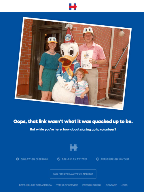
- great photoshop skillsoey
- I'll be in my bunkmarychain
- WHERE IS THE DOGEAR?!Al_dizzle
- QBN homepage of shameernexbcn
- ^ Fucking-A. Glad I'm the only one at work at the moment...elahon
- mom!? get off the internet!dasohr
- I just puked a littlepinkfloyd
- this is so badoey
- Thank god that's photoshopped.jtb26
- Also what the actual fuck.jtb26
- LMFAOmoldero
- & something something Marychainmoldero
- sarahfailin0

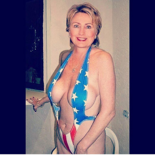
- Hill-baby you look so effing hot here.iCanHazQBN
- yeah...she looks REALLY great heremarychain
- Nathan_Adams0
I don't see the problem with it. The logo reduces really really well, which works well for what will obviously be a very social media heavy campaign. I'm sure it'll work well for the inevitable bumper stickers too.
There's also a thankful absence of overly patriotic stars and stripes and waving flags.
And of course, we're all looking at a single mark at the start of the campaign. If there's one thing Pentagram are good at, it's the greater roll out. A lot of their work of late has had a so-so mark on it's own, but it all comes to life when applied.
- nb1

Font is Hillary Bold, I assume by Pentagram.
- Not by Pentagram.
http://www.washingto…Nathan_Adams - Ah, I made the assumption because Bierut retweeted this image. My mistake!nb
- should be the official font of the new QBN. ^^vvArrows!!>><<sarahfailin
- Actually, I think the font they are using on the site is called "Unity"OSFA
- Killed the font, overkilled the idea and suggests uncoordinated, directionless action. Gets my vote!MrT
- Not by Pentagram.
- cannonball1978-4
You know what? I can live with it. And that's good enough for me.
If you want to get design bullshitty -
The two pillars represent the two presidencies. This is Hillary carrying the torch and beyond.
- cannonball19782
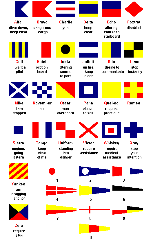
it makes me think of sailing flags
- I used to obsess over stuff like this when I was doing visuals for my band.mg33
- cannonball1978-3
also , you have to think for yourself.... if anyone is going to get a basic combination of shapes and hold the kind of weight to keep some staying power behind it, it's a presidential candidate.
Like, imagine if you were like "My logo is a blue square with a red equilateral triangle in it"
That's basically not far off from her. Hats off.
- BusterBoy1
Font is called Hilvetica 16.
- Elwin740

- flip it to 9/11Elwin74
- Appealing to the Jewish demographic?detritus
- 404sarahfailin
- sarahfailin0
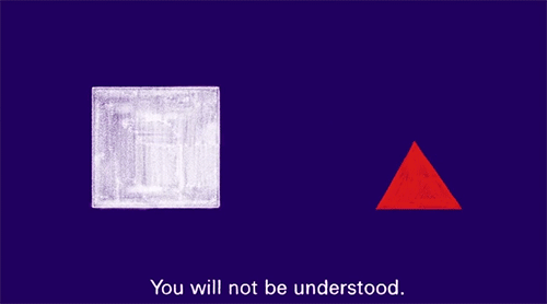
- My logo is a blue square with a red equilateral triangle in it.nb
- Jeremyhead0

- https://www.flickr.c…Jeremyhead
- lolcbass99
- i feel like I'm going to cut myself on that '2'PonyBoy