Logo Critique
- Started
- Last post
- 27 Responses
- desmo0
I like 1 and 3. finesse those a bit more.
- marianaspag0
You guys are brilliant! I feel that I will have to go back and do a lot more work on this logo, but I feel inspired by all the advices... and a bit confused. ;) Thank you so much!
- It's good to see that you're taking the advice well. Most folk who ask for a critique do a runner, never to be seen again. Good on ya and good luckgoldieboy
- Good on ya and good luckgoldieboy
- Thanks, working on it now. :o0marianaspag
- kepp us updatedpressplay
- *keeppressplay
- animatedgif0
^ Couldn't agree more ^
- albums0
No™
These type treatments are superfluous for an architecture firm. All featured here are amateurish. None of them timeless, or inversely, quirky enough for architecture.
The suggestion to take the "lid" off the first option is good. You might try using outlines on that shape as well. Something simple and understated with meaning will be sufficient.
Lose the word Studio, it's cliché. Use only the word URBE, placing it to the right of the mark. Letter spacing should be increased.
- HAYZ1LLLA0
^ Not as helpful as that but my choices are...
#2 then #3
- identity0
A suggestion from a designer who designed for an Architecture Firm.
What is the onus and vision of the architect's work? (not just this building - but what's the common thread through all of them?)
Conceptually speaking, does the rigid modernity relate/interact/engage with the environment?
Is the work about sustainability?
Is it about the possibility of pre-fab construction and the environmental benefits?
My Favorite archi-logos/brands cleared the hurdle 'make it look like the building(s)' and instead mined the inspiration at the heart of the concept that formed the structures.
I'm on a lot of medicinal drugs at the moment, so this probably doesn't jive as well as I'd like it - but ultimately, when creating your brand mark (logo) the earliest back you can go (why did you start the firm? what do you want to accomplish? what separates you?) you're going to be able to dig up a lot more substance to work with than an A-to-B execution.
- Great advice! Will go through some research again, and more authentic forms would come up.marianaspag
- formed0
As an architect, I'd like my logo to look like my work. You make something avant garde, it should show, spanish med, it should show (and God help you if it is the latter).
Try taking an elevation of theirs, playing with the figure/ground of the planes and volumes. You'll be surprised how quickly you can create a form that is powerful, simple and truly theirs.
- instrmntl0
i like the second one
- Nathan_Adams0
You've posted these up with out any context, or much explanation of the concept behind each. Is there a concept you're working to (aside from the obvious roof line in #4, but that implies they only do residential)? "Clean, smart, but friendly" could apply to absolutely anything.
- knobheadfadein11
- How is that being a knobhead? Are we critiquing just aesthetics, or an identity representing a company? Concept is necessary.Nathan_Adams
- suppose - think he just wants some feedback on what hes done though - not a lecture.fadein11
- Complexfruit0
Suggestion: In the stacked text executions, beefing up "STUDIO" ever so slightly, either by using a bolder weight or adding a stroke to bring them closer in visual weight.
- oey0
#1 but logo either not so heavy or to the left.
#3 I agree with the "studio" issue. maybe some perspective.nowadays you don't know, maybe it's not flat enough...
;)
- utopian0
#3
- doesnotexist0
gotham: an american typeface made by americans right here down the street from me.
find a new one. seriously, g'dmit. fucking trend rash.
- + 1, I will fucking remember that next time I want to use that piece of shitAmbushstudio
- Popular doesn't mean bad :/Sandman_1982
- sometimes it does thoughdoesnotexist
- this. Sers.. why Gotham?!?fresnobob
- doesnotexist0
- imagine these treated like your option 2doesnotexist
- lovely!marianaspag
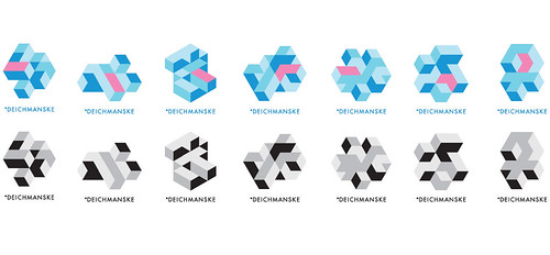
- doesnotexist0


not saying these are right, but the variation and play on the one mark-object thing says more about architecture than what i'm seeing.
- Doesn't matter how many variants there are within, I'm getting sick of seeing these as examples...detritus
- i know it doesn't matter how many you present, but the above presentation looks like 4 minutes spent.doesnotexist
- i am advocating that he explore that fucking shape some more because it's fucking boring.doesnotexist
- hate them all you want, they're good examples, d.doesnotexist
- doesnotexist0
like the idea of an isometric object like in #2, but i'd push it more to make it something special after seeing the above.
- MrT0
I like 1 and 2. As suggested the U could appear in the icon structures, and the backwards S shape in #2 is maybe saying interiors/exhibitions rather than architecture.
As for it needing Brazilian rerefences, sorry doesnotexist I think that'a a clumsy view. If you were offering a specifically Brazilian service to other countries then perhaps, but otherwise, why?
- and I think Gotham works well here too...MrT
- maybe it's wrong, but seeing gotham in there isn't right, imo. don't think it's about choosing a typeface.doesnotexist
- marianaspag0
Hey doesnotexist! Here is a pic of the studio being built. Studio does residencial, restaurants and they are now doing a factory.

