My New Project - Expedition Bureau
- Started
- Last post
- 89 Responses
- 23kon0
I like the perspective trick that your eye suggests with the EB in this one.

With the triangle looking like the focal area from a camera lens (e.g lens as point end) and the EB being a subject.
Even though the EB is dead straight along X axis it looks like it's skewed.- "B" is so tight to that edge. It really bothers me for some reason.
mk80
- "B" is so tight to that edge. It really bothers me for some reason.
- 23kon0
focal area from a camera lens / or a projection from a projector
- ideaist0
Jesus, just checked back in let me absorb all of this...
- ideaist0
mg33, things are moving along quite well!
I think attempting a version combining the following:

+

From their, try different version reducing element by element...
; )
- mg330
OK, here's a thought. I really like wireframe globe and I'm thinking about instead of using the lines, fill the solid space instead with orange on top, green on bottom. I'd use a different globe with larger sections from the latitude/longitude lines. Ex: something like this but with straight horizontal lines.

Again, I really appreciate all the advice. I knew this site was good for something. ;)
- JackRyan0
A thread like this is actually happening...GO QBN!!!
- mg330
Yeah, it's cool JackRyan! I'm psyched about getting this off the ground. I'm getting laid off from my job and about to have some (hopefully short-term) free time on my hands to really move things along.
- albums0
In regards to that globe, do you plan to have paths on it maybe a summit flag? Anything other than the lat / long lines? I like ideaist's idea of the globe on the pennant. If you're going to go with the globe, I suggest a bit of an angle to match the planet, 13° or so. But I'd think you have to do something to set it apart from all the other icons like it.
I think it's too generic
https://www.google.com/search?q=…- In those results, this illustration is cool: http://makingmaps.fi…mg33
- i eyeballed that one too, but didn't see how it played into your thingalbums
- I didn't mean to suggest that. Just a cool illustration. I love old stuff like that.mg33
- I feel like your globe needs mountains on italbums
- mg330
Not a bad idea albums but for some reason the thought of it tilted to expose a pole makes me think too much of a expedition to the north pole.
- albums0
Also, my thought earlier, on the globe, before I had time to comment, was with your type. Combined with the globe, it felt kind of amazing race-y to me, which I didn't like. I feel like you're going for something more authentic / personal and in the dirt, maybe your colors should represent that more and then the globe could feel more fitting.
- mg330
albums - it's interesting to think through this. I think I mentioned this above, but here's my rational for both logo directions:
Flag / Triangle: Expedition. Representative of staking a flag in a location you have visited. Think arriving at a summit or a destination. Claiming something.Globe: Bureau. Representative of the world and ability to travel anywhere within it. Reporting of / sharing of locations.
One other thing I thought of initially was something like a camera iris. It at least has an instant connection to photography, which is the purpose of the site. I could probably do something like this and incorporate the text colors, perhaps include the EB in the center. One thing that's important is that I want an icon that I can use in a small square for social networks.

- utopian0

- Something like that, yeah. I'll play around with it tonight. Gotta head home in this snow storm.mg33
- Here is the vector:
http://images.wikia.…utopian
- mg330
You know what bums me out? That shitty logos guy has not contributed to this thread. I have a sad.
- vuc0
Nice work everyone. Feeling the collaboration. Tap yourselves on the backs.
- albums0
mg33, so if you initially wanted, but don't like the flag because it is no longer "flat" as presented above. Why do you like the globe, as it is not "flat" either? Are there other icons you could draw inspiration from instead of the globe and maybe a telescope or even something as simple as a compass to give reference to the expedition itself. I'm not sure if they make land sextants, but you get my point. That way you can still work something fitting in the small icon space. As far as the aperture in the logo, that has photography written all over it.
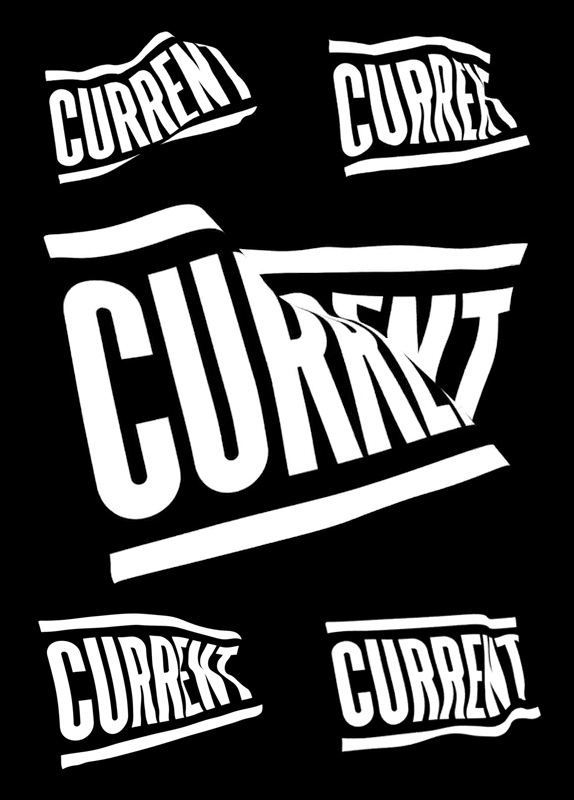
- randommail0
a good flag logo