This headline style
- Started
- Last post
- 21 Responses
- ********
Does it have a name?
It's in every student portfolio under the sun, and normally accompanied by weird webdings and illy symbols.
It'll be dead by summer 2013, but wanted to know what people actually call it (sarcastic answers accepted, but not encouraged).

- ********0
Cultural event invitation style
- ********0


- arne0
wheel of fortune
- monospaced0
This is what the kids are doing now? I haven't seen a student port in awhile.
- i_monk0
This trend has been just under the radar for a while. It's like that ugly typo Korean designers get away with (and ffffound loves).
- yes... my Korean students years ago seemed to LOVE typos, proper grammer seemed ILLEGAL to some of them.... not sure why?vaxorcist
- sure, but one of my students said he simply didn't really want to learn English that well, he was going back to Korea anyway....vaxorcist
- typo = typography
twit = vaxorcisti_monk
- Horp0
Its evocative of British letterpress avant garde c1960s, Polish/Czech poster art and concrete poetry (certain avenues of it, not the whole thing in its entirety).
If its become ubiquitous and I had to give a name to it, I'd probably call it 'next fad design substitute'. The good thing about that title is that it can be re-used indefinitely, saving time in the future.
- utopian0
monospaced bump
- BaskerviIle0
site like:
have a lot to answer for.
I wish design students these days were inspired by the world around them, and not just 'inspiration sites' aka ' things to copy without thinking' sites.
Yours, a curmudgeonly old designer
- Yep, its I've seen a lot of ffffound stuff go directly into students portfoliosqTime
- elpaso0
dutch
- mg330
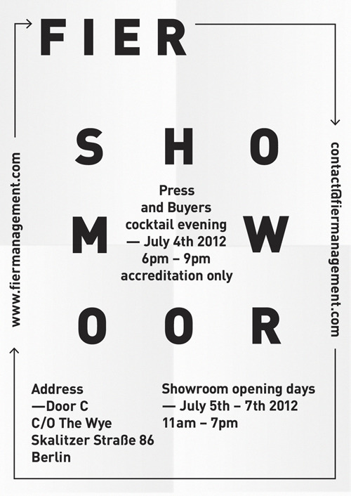
Vertical text really pisses me off. It's such a bad design element, especially in the context of some of those images above in which it's meant to deliver information, and not just serve as some random visual element. It works in newspaper or magazine design because you can physically hold it and move it to read everything.
It goes without saying that I've wanted to punch every website that's ever had vertical text - especially for navigation - right in the face.
- It's not 'information', though.
In the examples above 'style' trumps information.******** - as long as the type is easily digestible i.e. one or two words then we cool. and agreed - it works more in printed mediumsinjun
- It's not 'information', though.
- Frosty_spl0
It's the urban outfitters of design. Shit.
- neandersthal0
Needs more Anthrax.

- ********0

The publication and exhibition "Planstadt Eisenhuettenstadt" is meant as an possibility for an recognizing and understandable approach to this field of tension. Therefore, we questioned what's to be found aside of stereotypic choices, because everyday life is of course going on in UNO's worlds biggest surface monument.As authors we wanted to document the present status quo of Eisenhüttenstadt, cross the axes of the planned city,
walk on it's borders, and collect experiences of the citizens for an deeper, self reflected discourse
on the relation of man and architecture on this special place.
- sandpipe0
this style exists since decades.
sometimes it's hot. sometimes not.
now it's hot. 2013 it's warm. 2014 it's cold...
2023 it's probably getting warm again...
it's ok.
- i_monk0
I don't think it's all that hot. You don't see it in mainstream publications anymore than you see Fortune 500 companies adopting saltire logos.
- non0
It's probably Hort's fault.
- ohhhhhsnap0
bump


