Tweet of the Day
Tweet of the Day
- Started
- Last post
- 1,232 Responses
- imbecile2
- she's got good pointsmonospaced
- I am figuratively laughing out loud.ID_212-198-236-93
- but you can't prove the earth is round, because she's got good pointsmonospaced
- looks like a troll account?scarabin
- She has to be a Christian with those facts.utopian
- or just a critical thinker who does their own research instead of believing everything the "scientists" tell themmonospaced
- wow, looked into it and it seems she's been like this for years. sounds like schizophreniascarabin
- lolmoldero
- "research it!"drgs
- +1PhanLo
- Seeing this tweet again, I thought she'd be dead by now, what a dumbfuckPhanLo
- Cuckoo for Cocoa Puffsutopian
- Ianbolton0
Imagine Trump trying to fit into this?https://hips.hearstapps.com…...
- utopian4

- He is Risen!skinny_puppy
- cara de um, cú do outrooey_oey
- Elvis didn't have piss-colored cotton candy hair.jagara
- Elvis was blonderobthelad
- He was. Wow.jagara
- spookyGardener
- Elvis was a paedo too.Nairn
- Elvis died on the toilet after eating too much burgers, so... fingers crossed.PhanLo
- flol, that too! hahaNairn
- sted2
It is REAL!% :D
- Ramanisky28

- When you see the image in passing and think "Bobby Petrino has finally stopped giving a single shit".garbage
- https://cdn.theathle…garbage
- I'd say he looks more like Bert Newton WITH hair! LOL!sab
- OBBTKN0
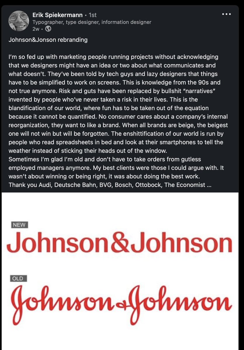
- Or maybe — just maybe, Erik — J&J got a bit tired of their wordmark looking like it said "Jolmson & Jolmson"?Continuity
- I do remember a few years back everyone making their branding as boring as possible so it would look good on Insta. I think I gave up design then.PhanLo
- Well, true. But it's not like the old J+J identity was all that spectacular itself.Continuity
- It's not that fabulous, you're right. Probably a bit hard for folk to read now since they don't understand cursive too.PhanLo
- Cursive hasn’t been taught in schools for well over 20 years. That means young parents and kids maybe can’t read this brand. Lolnb
- I prefer my logos in hieroglyphsmilfhunter
- They should change it to Johnson as well as JohnsonBK
- Nobody sees that and doesn’t know it’s Johnson and Johnson. It isn’t a legibility issue. The wordmark was perfect before.monospaced
- And fuck this. I’m teaching my kid cursive. That’s bullshit.monospaced
- My kids both write in cursive. 11+7HAYZ1LLLA