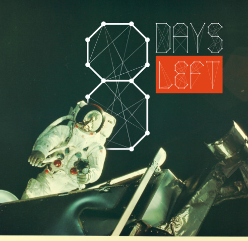
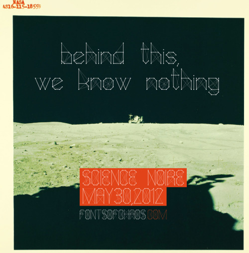
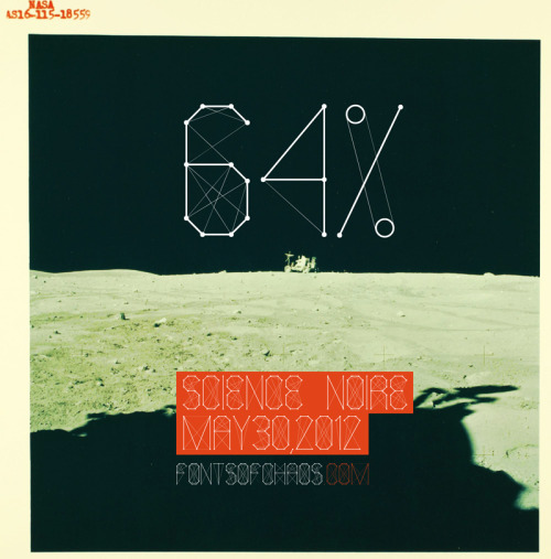
Science Noire - new font
Science Noire - new font
- Started
- Last post
- 9 Responses
- dasmuse0
Nice illustration, but is more confusing with all the line. When i make Science Noire i try to have something more readable. The stroke line are 8 time bigger thant the point line. For exemple i have an other font that i share for free "Porno Junky". Here the stroke line are 2 time bigger and is not so readable than Science Noire

- zoozoo0
I commend you on a nice font. Although t could look a bit spider-like... with the webbing and all.
- albums0
fun, are the same line treatments going to be made the symbols as well?
- antimotion0
Interesting - just saw this today from Kenzo Minami:
- antimotion0
Here's the pic:

- sublocked0
interesting idea on a font. will there be a variation with none of the "spiderwebs" and one with full "spiderwebs" so we can layer/control the opacity/color of them?