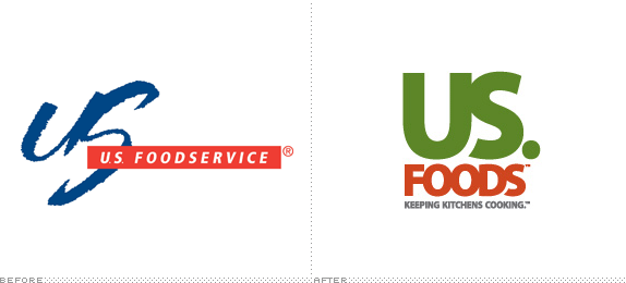
US Foods Rebrand
- Started
- Last post
- 12 Responses
- hektor911
Im thinking kerning is off. Although I know if was done purposely. What are you thoughts?
- hektor9110
- Let me guess, ad hoc ligatures are now a vegetable.? Is that it ? American food is fucking dogshit, especially catering.mikotondria3
- american food is fine. fast food is shit.scarabin
- idiots0
that should print just great at small sizes :/
- hektor9110
I like the color scheme!
- i_monk0
US.
Really?
- scarabin0
the out-of-place gap between the S and the U bothers me. and why is there a period after the S? it's not a sentence and if were an initials thing there'd be one after the U as well
- Jesus ur picky.mantrakid
- ;)mantrakid
- I agree about the period... it's totally out of placemonospaced
- an identity system is something to be picky about, i'd sayscarabin
- monospaced0
I don't see the point of even making a fuss over this. Nobody even sees this logo; I know I never saw the original one.
- then keep it to yourself? why talk just to say "let's not talk"idiots
- haha, should I start responding to your comments like that?monospaced
- tasty0
the negative space between the U and the S creates a horse head...tasty tasty horse meat for everyone.
- no, they're long cartoon boobsjohnny_wobble
- LOLcannonball1978
- nb0

- albums0
I saw this on the street on a couple of semi trucks today. The accompanying imagery looked really good. I remembered the horse head (above) but it was not an issue optically even though the logo was 10 feet tall. Funny the only thing it reminded me of was this thread. ;)
- capn_ron0
I work right across the street from a US Foods. Seen this new logo for a long time.