London 2012 Posters
- Started
- Last post
- 32 Responses
- Aa770
- monospaced0
Ummm... no, definitely not for the Olympic Games.
- Paralympic... even still... no.monospaced
- WWII pamphlet, Hitler is coming to destroy us!Beeswax
- 1992 wants its style backfresnobob
- set0
Pile o' shit
- goldieboy0
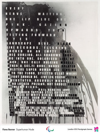
Gary Humes caption on the BBC's website, along the lines of: the big circle is a wheel chair, the small circle is a tennis ball!
Right... Thanks for that classic art school blag! They're all dreadful. Can't wait for the opening ceremony... It's going to be special!
- Projectile0
There isn't a single one that I like. But they're made by people who have done awesome stuff in the past so therefore must be cool! :P
It's almost as though they were just handed the money and told "just do something ..um... olympics related I guess. Doesn't matter how good it is, well accept the first draft"
- i_monk0
They're all terrible.
- Jaline0
Some of them are selling for thousands of dollars.
- bainbridge0
I like these.
Finally art instead of design. Logo is still the worst.
- showpony0
holy hell...
- hellobotto0
Miguex, I like where your head's at. I'm down for a collaboration, but I'm not English. Is it a touch off if folks aren't local?
- numbers0
bump
- Handel0
It does seem quite unorthodox that these lack a cohesion across the editions. Considering the weakening primacy of printed matter in our current age, perhaps this was decided (by a committee I can only assume) to be more of a populist exercise.
Accordingly, web/mobile communications could be the media that is better harnessed this summer.
- Beeswax0
They should've let art students create some stuff.
There are epic works in the history of Olympic posters but these are epic in an unconventional way.
- Miguex0

Let's start our own series of posters instead of turning down other's peoples work, if a bunch of us contribute and we keep it serious we can get some attention, maybe more peeps participating...
anyone down?
- goldieboy0
Good god! What a pile of shite! Tracy Emin... Say no more!
- ETM0
The series looks like an art class project.
- i_monk0
Did they crowd source these?
- detritus0
I like Rachel Whiteread's effort.